The basics of market reading
From this article you will learn the basics of market reading: identifying lack of demand, testing supply, pushing up through supply, high volume on market tops, marking markets up or down.
Dear friends!
In the previous post (Masters of the market. Part 1 here) I described the basics of how the market operates in general, the influence made by market-makers on the price movements, and how to tell whether the market is strong or weak. Today, I will deal with some secrets of the market reading. Today, I will deal with:
- identifying lack of demand,
- testing supply,
- pushing up through supply,
- high volume on market tops
- marking markets up or down.
How to identify lack of demand
The lack of demand is one of the most common indications you will see and it is pretty easy to spot.
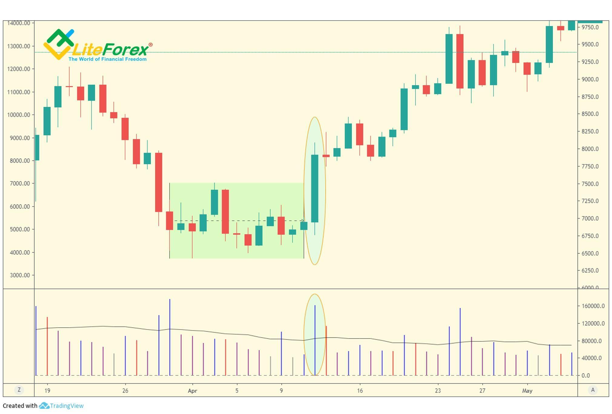
The pattern is identified as a bullish bar with narrow spread (the relatively small difference between its high and low), which is followed by two or more down-bars with a narrow spread as well. Besides, the bars described above should have low volumes. If you watch such a formation, then there is no selling pressure, and so, the current price fall is temporary, and it should be soon followed by the continuation of the bullish trend.
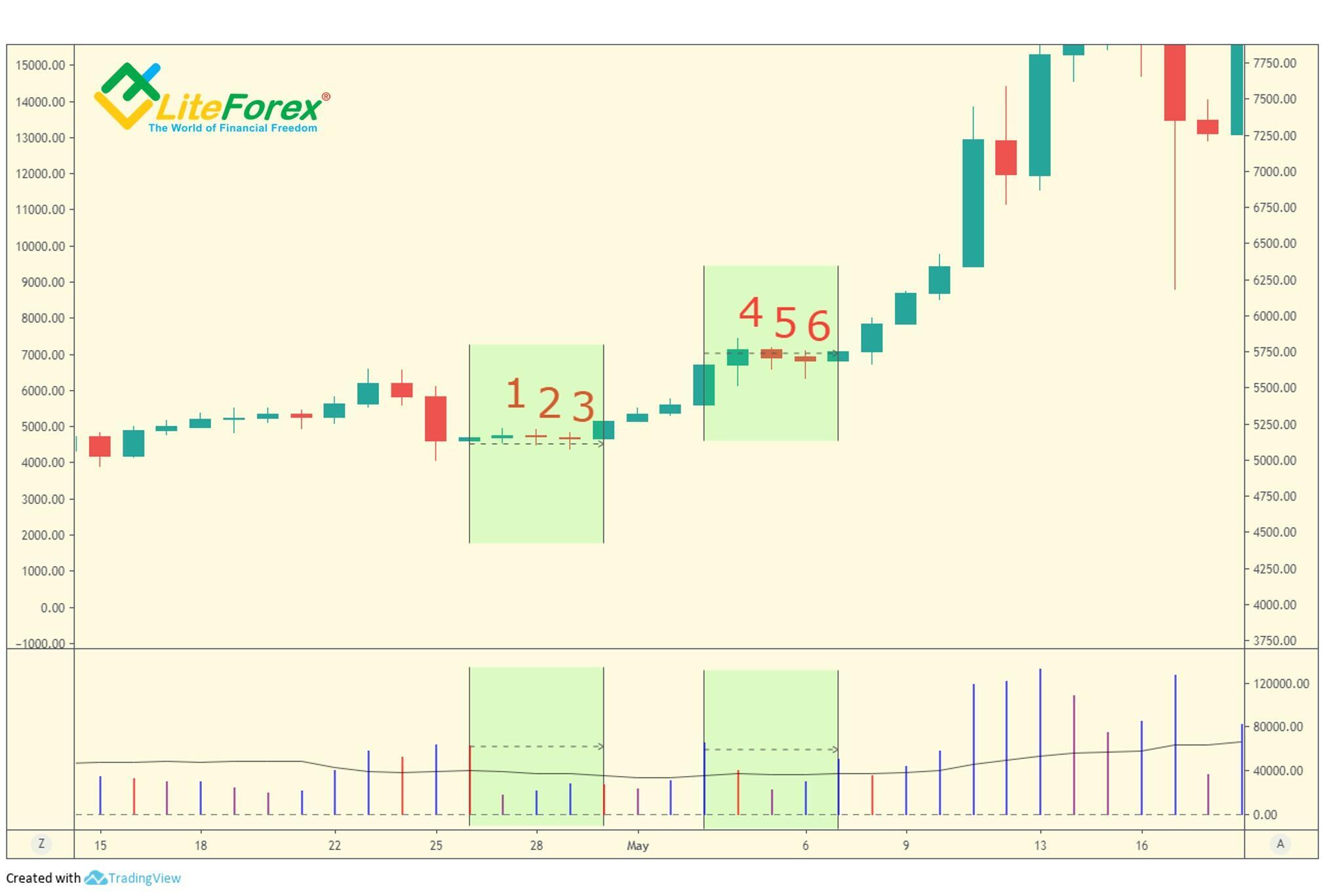
In the daily BTCUSD price chart, two clear patterns are indicating the lack of demand. They are both in the green zones. In both cases, there is an up-bar with a narrow spread compared to the bars next to it (bars 1 and 4 in the chart). The bar is followed by two down-bars with very narrow spreads (bars 2,3 and 5,6 in the chart). Besides, the volumes corresponding to the studied bars are significantly lower than those of near bars. Therefore, I can assume that there is a lack of selling pressure and the bullish trend should continue soon. As you see from the next bars, the forecast has been met, as the price is going up with the direct influence of market-makers, which is proven by high volumes.
The lack of demand is often accompanied by market uncertainty. Besides, most traders fail to link human behavior (in this case, of professional traders) with the price spreads and the volume, but would rather believe the mass of incoming 'news', which inevitably differs from what supply and demand are signaling.
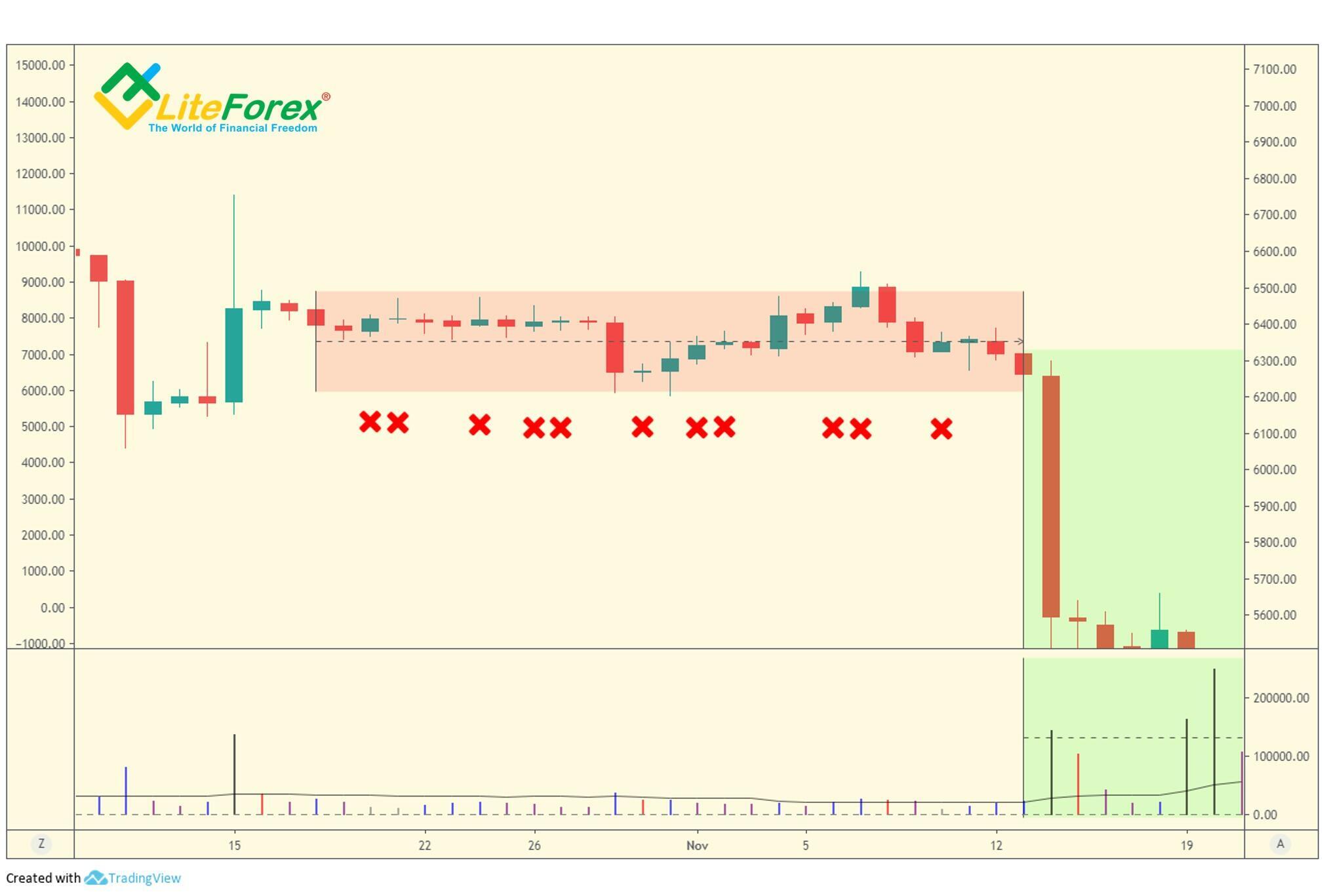
The chart above shows a market that is completely devoid of professional support. All the bars marked with a red cross are closing higher than the previous bar, on low volume and with narrow spreads. That means the price has now support and so, the previous highs will hardly be broken through. With this lack of demand, the market will rather tend to a new low than will gain enough support to move up.
One of the most common beginners’ mistakes is that they are shorting the market following any sign of no demand. However, traders, who are more proficient at market analysis, expecting more confirmation. For example, a confirmation will be a narrow spread up-bar on greatly increased volume. It means that professional traders have started to sell assets to eager uninformed buyers. Prices are being kept high on purpose.
Or, as in the chart above, a sell signal will be wide spread down-bar on greatly increased volume (marked with a blue circle). Such a situation emerges when selling pressure is formed by the support of professional capital, which means that a steady bearish trend is emerging.
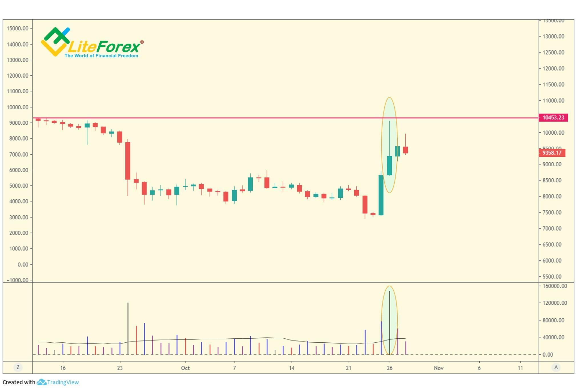
Testing Supply
The danger to any professional operator who is bullish is supply coming into his market, i.e. selling. It is too dangerous to buy it out since, due to artificial demand, the price can go up, and then fall sharply when it decreases. So, before entering long trades, it is necessary to make sure that the supply has been completely removed.
The best way to find out is to rapidly mark the prices down. This challenges any bears around to come out into the open and show their hand. This will also catch any stops below the market, which is a way of buying at still lower prices. By the way, this technique is s sometimes known as a springboard among traders.
Usually, a successful test (on low volume) signals that the market is ready to rise immediately, whilst a higher volume test usually results in a temporary up-move and will be subject to a re-test of the same price area again at a later time. In the chart, this pattern has a “W” shape. This pattern is sometimes referred to as a “dead cat bounce” or a “double bottom”.
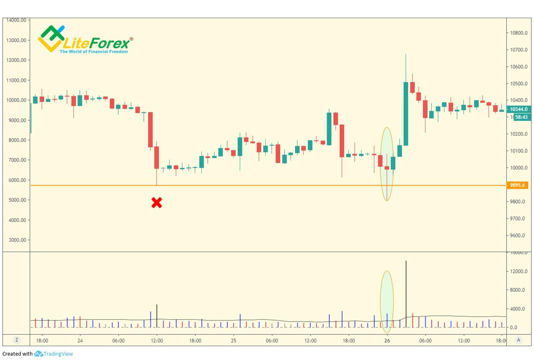
In the hourly BTCUSD price chart, the testing supply is marked with the oval zone. When it was forming, the price went down into an area of previous low marked with the red cross. Next, the price regained and the bar closed near the high on a relatively low volume. So, there is a lack of supply and the price is about to jump up, which happened a little later.
Besides, another signal is the apparent market strength. Differently put, the market should respond to the test immediately with higher prices, or certainly, during the next day or so, this can be considered an indication of strength. If this is a true sign of strength, market-makers will immediately start buying, which will be clear from a new uptrend on high volume.
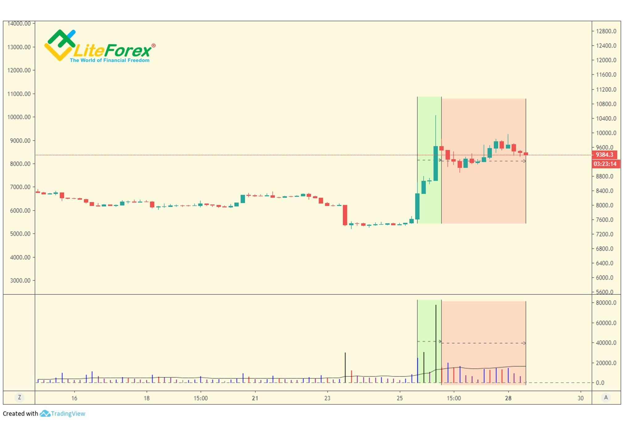
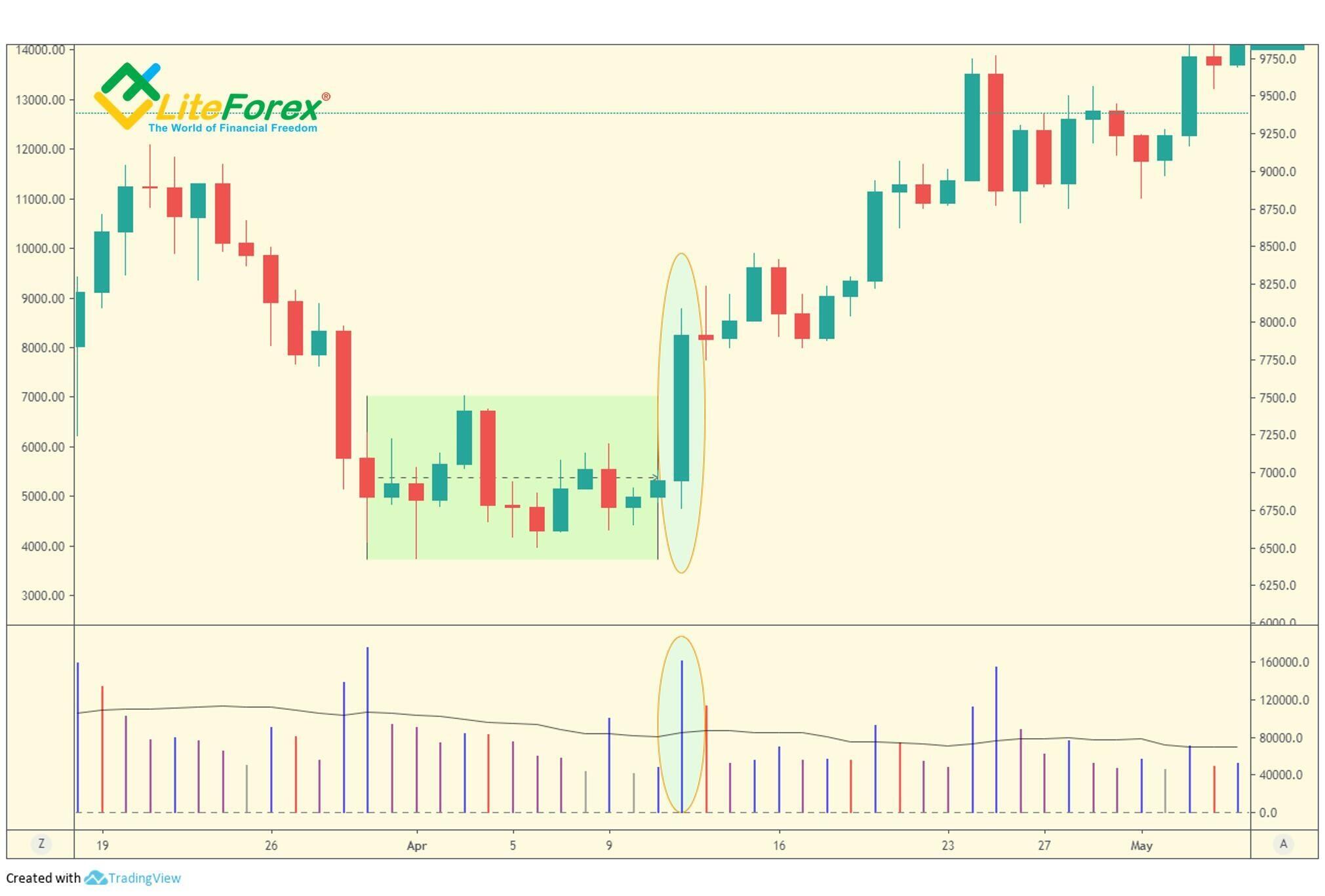
Pushing up through supply
In the last lesson, I wrote about locked-in traders, whose main concern is to sell and recover as much as they can, hopefully without losses they represent potential supply (resistance) to the market makers. If they are bullish, and higher prices are anticipated, the market-maker will certainly want a rally. The problem now is how to avoid being forced to buy stock from these locked-in traders at what, to them, may appear to be high prices.
If the price rises too slowly, market-makers will have to buy the selling from these locked-in traders at a relatively high price, otherwise, the selling pressure will just block the price growth. Market-makers can cope with this problem with a rapid, wide spread, or gapping, up through an old area of supply as quickly as possible, which will turn the positions of the locked-in trades to be losing. To the informed trader, it is now a clear sign of strength.
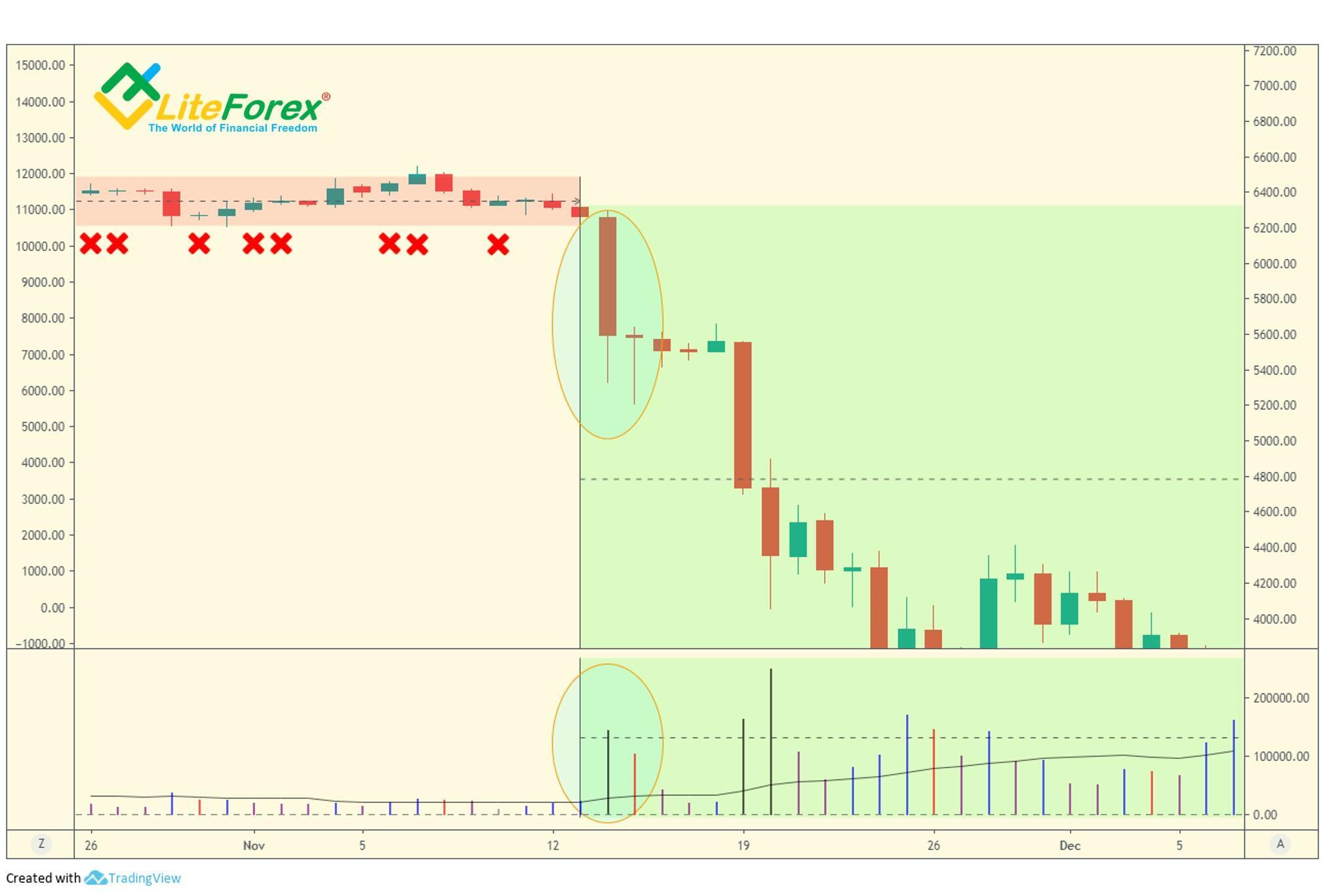
In the chart, pushing up through supply is indicated by high volume accompanying wide spreads or gaps.
In the daily BTCUSD chart, locked-in traders are marked with the green zone. The resistance level is at the top of this zone. A rapid up-move accompanied by high volume shows that the professional money was prepared to absorb any selling from those locked-in traders who decided to sell, which encourages other traders to enter long trades thus pushing the price higher. In addition, those traders who have shorted the market will now be forced to cover their poor positions by buying as well. Furthermore, all those traders not in the market may feel they are missing out and will be encouraged to start buying.
If you see any testing or down-bars on low volume after this event, it is a very strong buy signal.
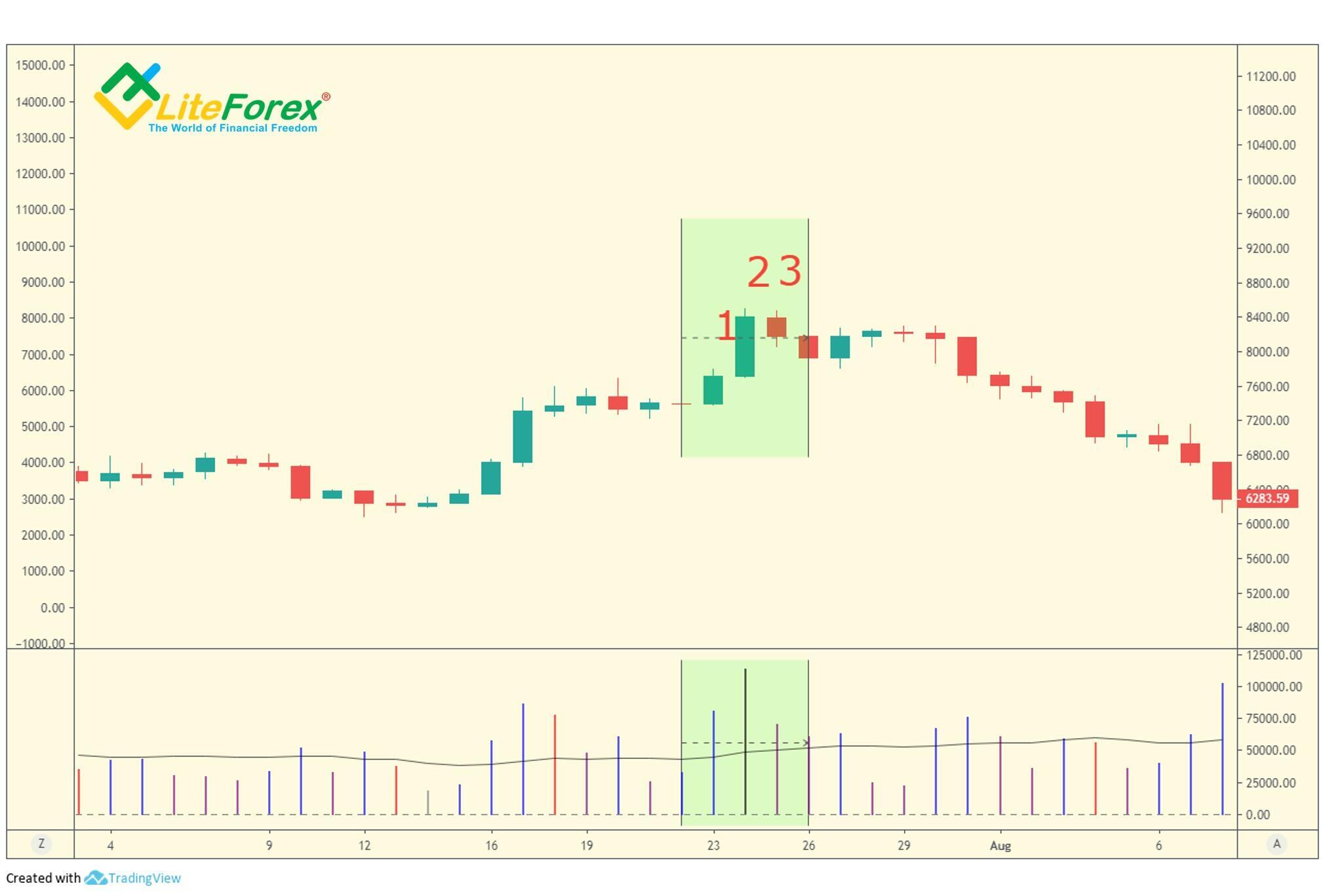
High volume on market tops
Many inexperienced traders assume that when the market hits new highs on high volume, this is buying and a continuation of the up-move (the news is ‘good’ and everybody is bullish). This is a very dangerous assumption. In reality, a new high on the high volume itself may signal both the trend continuation and its reversal down.
A stronger signal that the bullish trend will continue is when a higher price is reached on the next bar after breaking through the high. A high volume up-day into the new high ground with the next day level or down is an indication of weakness. In this instance, buying took place in fact. However, the buying has most likely come from potential weak holders who opened their positions near the top and, by the time the price reaches the high, they are already trading opposite the market.
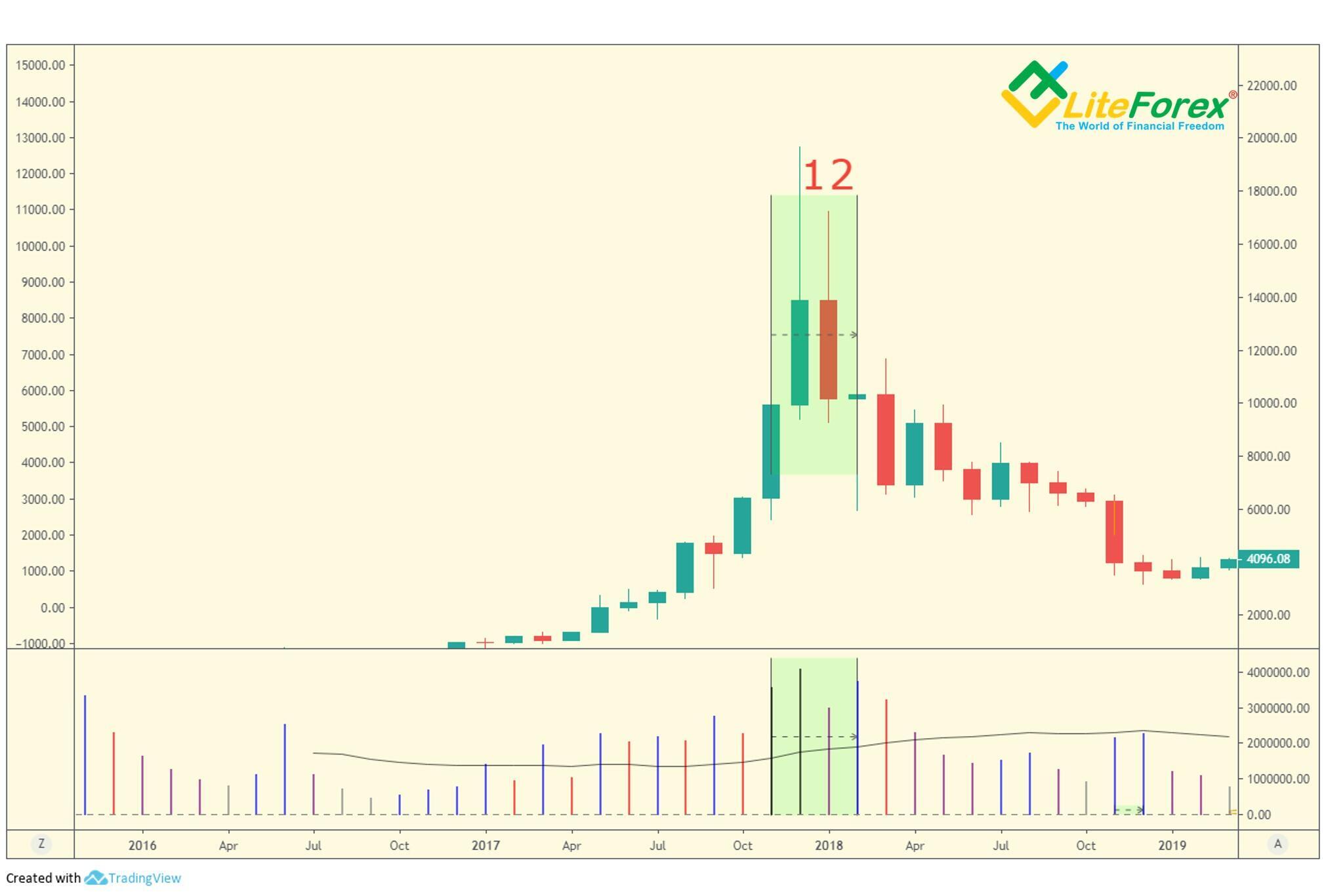
In the monthly chart, bar number 1 marks a new local high. It is accompanied by high volume on near bars that should suggest that bulls are trying to mark the price up. However, the next bar, bar 2 closes lower than the first one. So, the high volume is likely to have been created by weak holders, and the market is actually weak. The market weakness is later confirmed by the trend reversal downwards.
Now, let us see the situation when a new high on high volume signals the continuation of the rally.
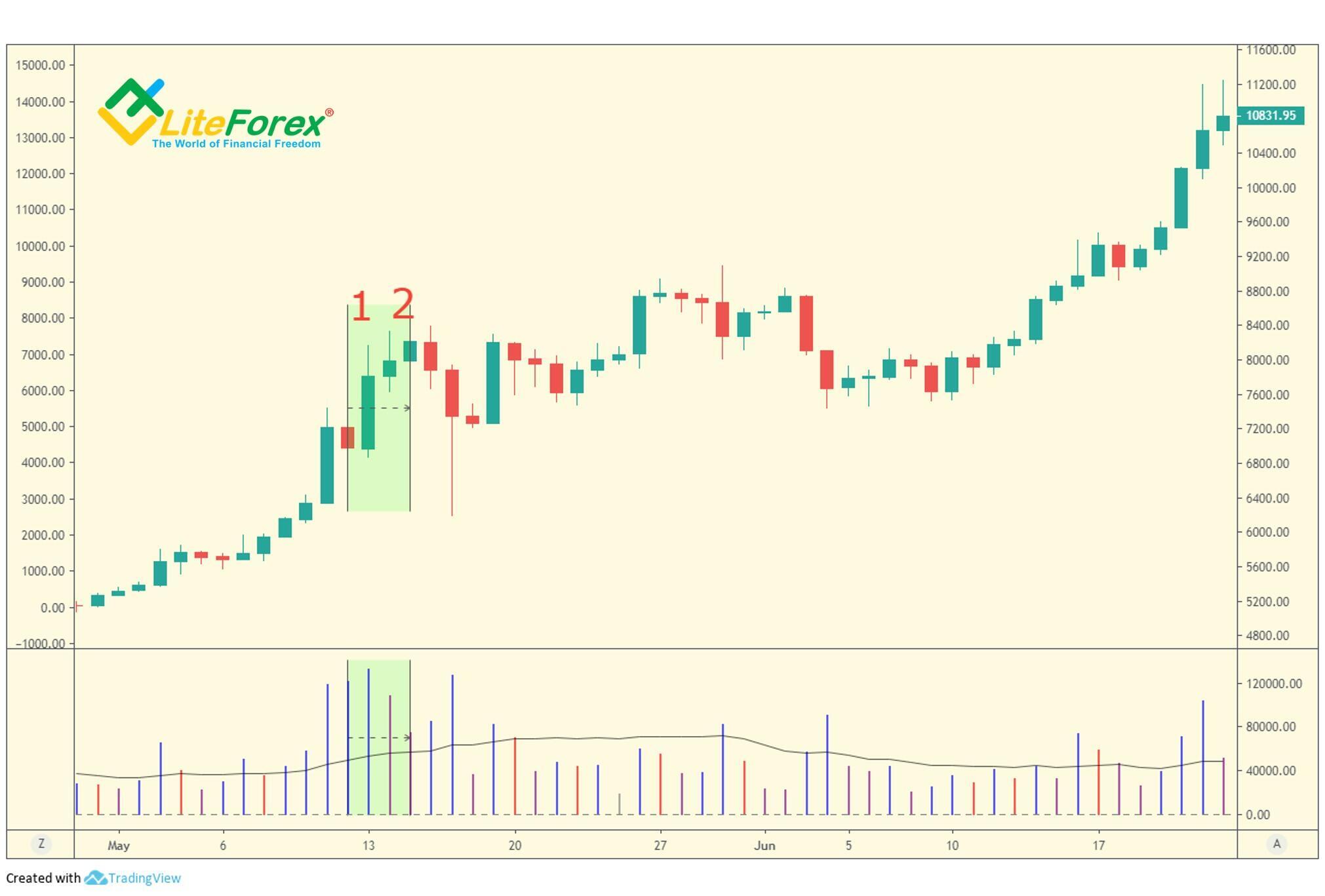
Here, the situation is similar in the daily chart. Bar number 1 hits a new local high on high volume. Furthermore, the price goes up on the next bar on high volume as well. It means that market-makers are bullish. Later, price growth continues.
By the way, I frequently use different timeframes in the instances to show how the VSA method works on any mainframes.
Markets can be marked up or down
Market-makers, specialists and other professional traders, are not controlling the market. They are simply taking full advantage of market conditions to improve their trading positions. However, they can and will, if market conditions are right, mark the market up or down, if only temporarily, to catch stops and generally put many traders on the wrong side of the market.
Common traders can’t influence such manipulations, however, we can identify them. A false market move is accompanied by low volume. The second important signal is a continuous move in the same direction. If there is no trading going on in one direction, the genuine trend is generally in the opposite direction.
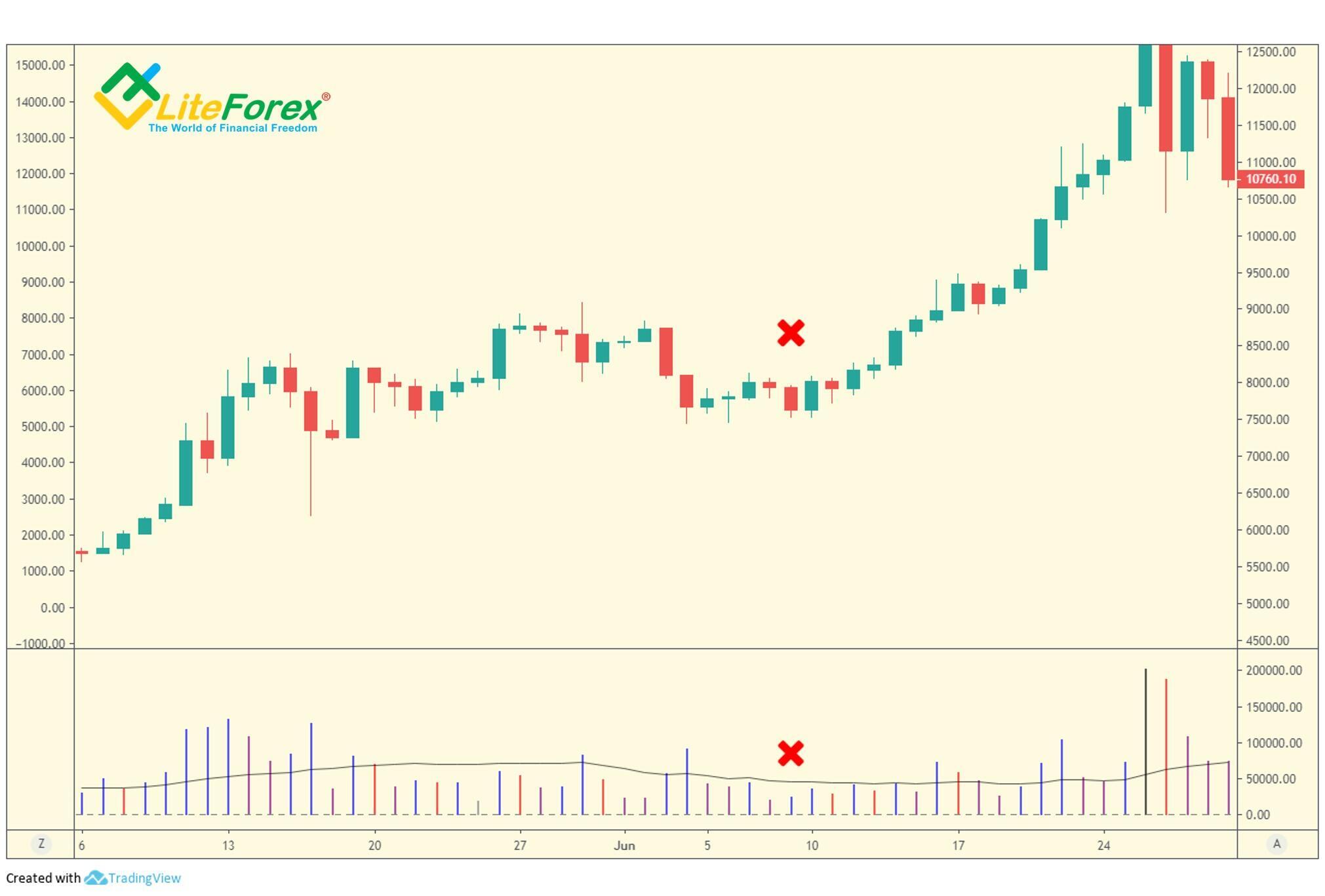
The down-bar on low volume is marked by the red cross in the chart. After it closes, a long-term bullish trend starts. In such situations, you should not start selling immediately, before the down-move is accompanied by high volume.
Using different timeframes
I am going to share with you some techniques that will help you read the market even when nothing seems clear.
By analyzing a single timeframe, you will often face situations when there is nothing very much you can read about the market situation. Or the indications may not be very clear, and it becomes quite risky to enter any trades. Another error, that day traders often analyze hourly chart or shorter ones, ignoring longer charts. At the same time, position traders do not care about big scales, i.e. short-term charts.
Trading with the VSA analysis is the most efficient when you analyze different timeframes. Intraday charts are useful to position traders, as they often highlight indications of strength or weakness, marking the day as a bullish or bearish day, which then gives a very strong indication of how to trade the following day. In turn, intraday traders can benefit significantly from the wider picture offered by daily or weekly charts. This will allow you to trade with the market not against it.
I will give a simple example:
It is difficult to make out from the daily chart whether the bar marked with an oval is an attempt of market-makers to break through the resistance zone to avoid massive selling from the side of the locked-in traders. On the one hand, the analyzed pattern looks like pushing up through the supply. On the other hand, the growth is not strong enough to be sure that there is a new local high. As you see, the price has stopped at the level of the recent high, where a part of locked-in traders could be in the market.
If you look at the H4 timeframe, the situation is getting clearer. Basically, the up-move was supported only during four bars (green zone in the chart). After that, the volume sharply decreased, so the rally is not likely to continue. In addition, the volume is almost equal on the up-bars and down-bars in the red zone. This means that the market is likely to trading flat, which should continue until the next test of the market or the surge in the trading activity of big traders.
Effort versus results
n the bearish market, the effort to go up is usually seen as a wide spread up-bar, closing on the highs, with increased volume. The volume should not be excessive, as this will show that there is also supply involved in the move. Conversely, a wide spread down-bar, closing on the lows, on increased volume is bearish and represents an effort to go down.
However, you should focus not only on the effort but on the result as well. The result of effort can be a positive one or a negative one.
In the chart representing pushing up through supply, there is a clear wide spread up-bar that closes on the high and is supported by increased volume. Furthermore, the price continues moving up, which means that the result of the effort to go up is positive, and so, the uptrend is strong.
Here, bar number 1 was a fresh local high before the second bar has appeared. Besides, the market strength seems to be proven by a continues up-move with an increased volume. However, this pattern yields a negative result. This results from bar number 2. It has become a new top signaling the market weakness as it is followed by a down-bar, bar number 3.
Frequently, you can see effort with no result in the chart. For instance, you may observe a bullish rally in progress with sudden high volume appearing on good news. However, the next day is down or has only gone up on a narrow spread, closing in the middle or even the lows. This is an indication of weakness which is confirmed as the market is reluctant to go up in the next days.
The path of least resistance
These basic principles will help you make wiser trading decisions reducing the risks:
- If selling has decreased on any down-move, the market will then want to go up (no selling pressure). If buying has decreased on any up-move, the market is likely to fall or start trading flat (no demand).
- Increased selling on up-bars forces the market up, and increased selling on down-bars forces the market down.
Bull moves run longer than bear moves because traders like to take profits. This creates a resistance to upmoves. The professionals do not like to have to keep buying into resistance, even if they are bullish. They may also artificially lower the resistance by testing the market, a shake-out or a sharp gap-up.
Bear markets run faster than bull markets. Most traders, unlike professionals, do not like losses and refuse to sell, hoping for a recovery. This way, they become locked-in traders that are forced out of the market on the lows.
This is all so far.
In the next training post, I will deal with trends and Volume Spread Analysis.
I wish you good luck and good profits!
PS. If you agree with my ideas, write “+” in the comments; if you don’t agree, put “-”. If you liked the post, just write thank you, and don’t forget to share the post. It is easy for you and I will be very pleased :)
Stay informed on the latest cryptocurrency news, follow my posts on the blog.
Useful links:
I recommend trying to trade with a reliable broker here. The system allows you to trade by yourself or copy successful traders from all across the globe.
Telegram channel with high-quality analytics, Forex reviews, training articles, and other useful things for traders http://t.me/litefinance.

Price chart of BTCUSD in real time mode
The content of this article reflects the author’s opinion and does not necessarily reflect the official position of LiteFinance broker. The material published on this page is provided for informational purposes only and should not be considered as the provision of investment advice for the purposes of Directive 2014/65/EU.
According to copyright law, this article is considered intellectual property, which includes a prohibition on copying and distributing it without consent.