If you take a different perspective on price movements, you may spot changes in market trends more promptly. Therefore, experienced traders do not rely solely on a Japanese candlestick chart but use additional tools.
A line break chart is an alternative tool for monitoring price action, enabling you to identify trend changes and open profitable trades. This article explains what a line break chart indicates and how to use it in trading.
The article covers the following subjects:
Although this chart seems complicated, it is quite simple to analyze. A line break chart indicates that for a market reversal to occur, the price will have to break through the previous three lines’s closing levels on the chosen time frame.
The default number of line settings is three, but you can change it just like a Renko box size in order to make the chart more responsive to market fluctuations.
Unfortunately, you cannot change the type of levels on the chart. It would be much more convenient if the chart showed the lines based on the highs and lows breakouts rather than closing price levels because these movements provide the final signal to determine a trend's direction. Hopefully, someone will take notice and create such an indicator.
Chart building
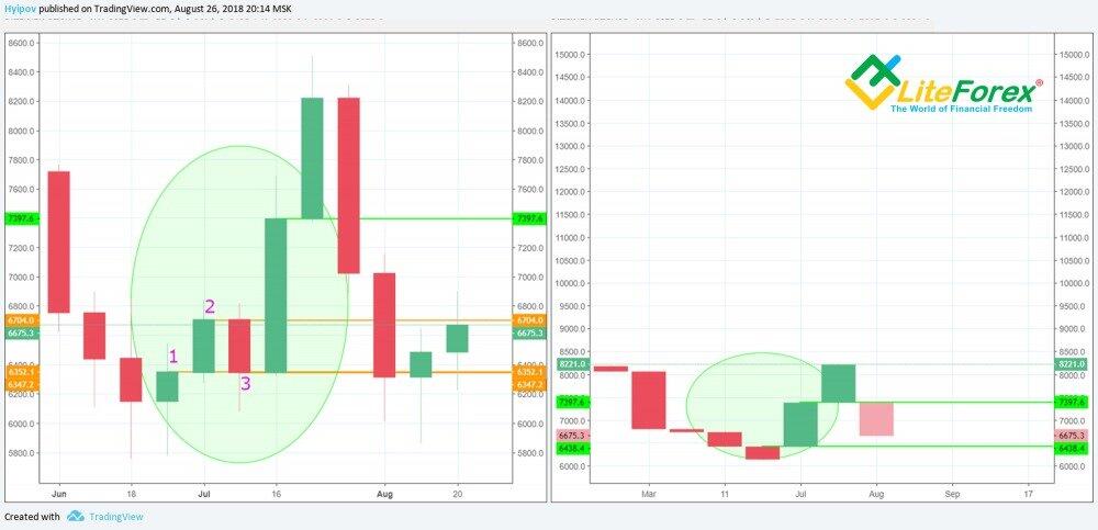
Let’s analyze these two charts on the weekly time frame. A candlestick chart is on the left side, and a line break chart is on the right.
The green oval marks the examined area. A long bullish candle, formed on July 16, broke through the closing price levels of the three previous candlesticks. These candlesticks are numbered on the chart. Therefore, a bullish line emerged on the line break chart. However, the line's high coincides not with the high of the Japanese candlestick but with the price closing level.
Thus, the line opening level on the line break chart will always coincide with the closing price level of the previous candlestick.
This indicator gives signals that are easy to interpret:
A buy signal occurs when three consecutive bearish lines are followed by a bullish line.
A sell signal emerges when three consecutive bullish lines are followed by a bearish line.
Notably, many line break chart users suggest expecting an additional line, following a reversal line and having the same direction. This line will confirm a trend reversal. Therefore, if the pattern is not complete, and down lines are alternated with up lines, you should avoid trading.
The Japanese have a tendency to give unconventional names to their patterns.
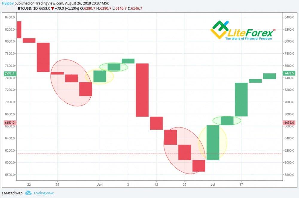
Let's analyze the bullish pattern on the line break chart.
The three bearish lines marked with an oval are called "shoes". The yellow oval shows a bullish line called a "suit,” which follows the shoes. The line enclosed by the green oval is the confirming line called a "neck."
The Japanese believe that you should buy when "the market puts on bear shoes and shows its neck in a bull suit." In other words, when it is fully dressed in a bull or bear suit.
Pay attention to the "suit" length. If it's too short, the trend may not reverse. This is exactly what happened in the first case on the chart when the length of the "suit" was very short.
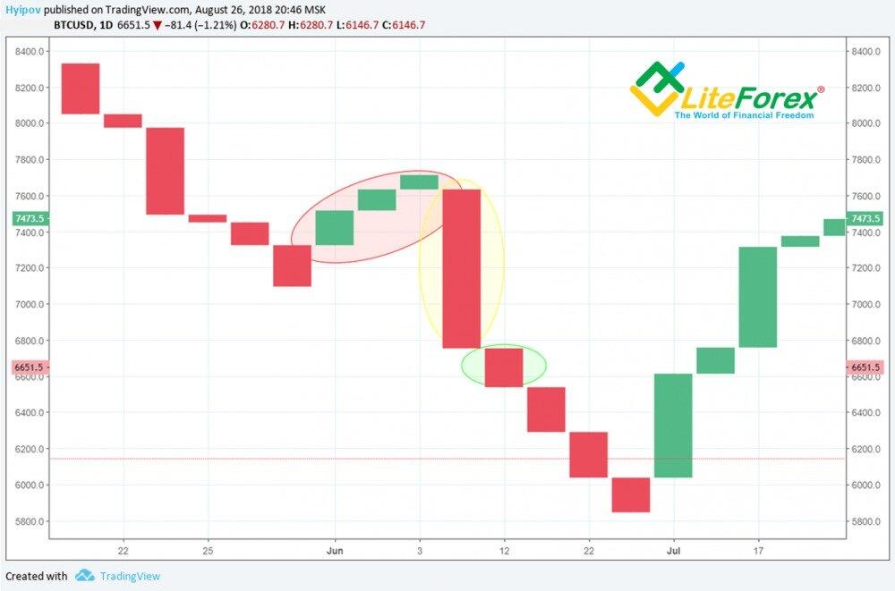
The chart above shows a sell signal when the market puts on a "bear suit." The same applies to a "bull suit."
Generally, this pattern has one significant disadvantage — at least half of the main trend may pass until the market shows its "neck." To reduce this lag, you can lower the number of breakout levels. Let's use the MACD and moving averages in the analysis.
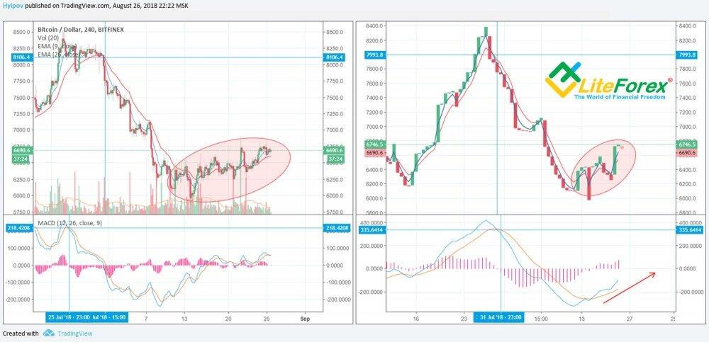
The line break chart shows a signal with a slight delay on the 4-hour time frame. However, in the case of sideways movement highlighted with a red oval, this indicator gives a lot of false signals and becomes ineffective. The MACD can be helpful here. The indicator does not show increased volatility on the line break chart, which is not the case with the Japanese candlestick chart.
Let's check this indicator in live trading in order to study it in more detail.
How to Apply Line Break Chart
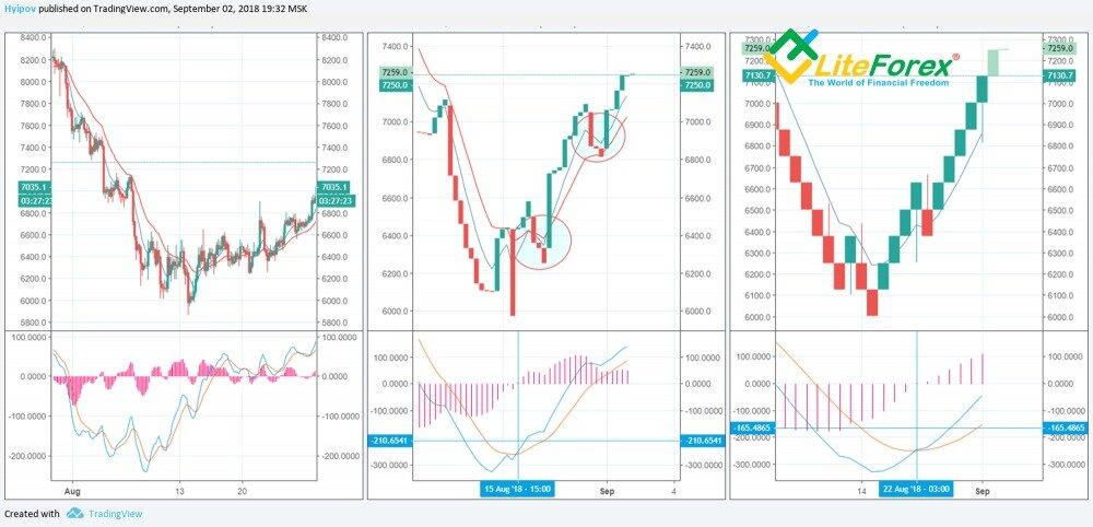
Below, you can find the analysis of price movements on the line break chart using the MACD and moving averages indicators. Renko and Japanese candlestick charts were additionally used to provide a full understanding.
A line break chart delivers the best results when three closing levels are used for analysis.
Using only two levels causes too many false signals, failing to remove market noise.
When using four levels or more, the line break chart starts giving signals with a considerable delay, missing the main price movements.
Compared to the Renko chart, the line break chart responds more promptly to price changes, which can be both a pro and a con. Although the signal can be received earlier, it may be false.
The line break chart located in the center shows two false reversal patterns marked with circles, but the price continued to rise.
It is better to use the MACD indicator for additional signal filtering. Moreover, the line break chart in the center shows that the MACD gives a reversal signal a few days earlier than the same indicator on the Renko chart.
Conclusion
A line break chart can certainly serve as a confirmation of a trend reversal. Similar to a Renko chart, this chart filters out market noise caused by short-term volatility. However, there is a risk of false signals during prolonged sideways trends within a wide channel. Besides, it seems strange to focus on the closing levels to spot breakouts. In technical analysis, the lows and highs are more significant breakout levels.
Line Break Chart FAQ
A line break chart is a type of chart that shows the quote movement only if the price breaks through the last three closing levels on a certain time frame. This method helps to reduce market noise, enabling traders to identify the beginning of a new trend.
When determining global trends and key support and resistance levels, it is better to use higher time frames, such as the daily one. For short-term trading, the hourly time frame is your choice.
Experienced traders often combine the MACD and moving averages with line break charts. Typically, a line break chart gives signals with a delay. However, additional indicators can help minimize the lag allowing traders to open profitable trades in time.
If a bullish line appears on a line break chart after three bearish lines, one may consider long trades. A short position can be opened if a bearish line emerges after three bullish lines. To remove false signals, use the Japanese candlestick chart, the MACD, and moving average indicators along with a line break chart.
The default line break chart is not included in the MetaTrader 4 technical tools but can be downloaded from the official MQL5.com website. The chart uses three closing levels by default, applied to a given time frame. You can change the settings to adjust the chart's sensitivity to the market noise.
Lines appear on a line break chart when the price breaks through the last three closing levels on the selected time frame. In other words, it signals a trend reversal. If the up line is formed after three down lines, it is a buy signal. Conversely, if a down line occurs after three up lines, it is a sell signal.
Line break chart lines emerge when the price consolidates above or below the last three closing levels on a given time frame, depending on a trend. This way, you can determine a trend reversal or its steady continuation.
The content of this article reflects the author’s opinion and does not necessarily reflect the official position of LiteFinance broker. The material published on this page is provided for informational purposes only and should not be considered as the provision of investment advice for the purposes of Directive 2014/65/EU.
According to copyright law, this article is considered intellectual property, which includes a prohibition on copying and distributing it without consent.