Dear friends!
This article continues the series of lessons devoted to Volume Spread Analysis.
In the previous articles:
- Masters of the market. (Part 1 here), I described the basics of how the market operates in general, the influence made by market-makers on the price movements, and how to tell whether the market is strong or weak.
- In the next article, The basics of market reading. (Masters of the market. Part 2), I explained the basics of the market reading, identifying a lack of demand, testing supply, pushing up through supply, and many others.
- Trends and Volume Spread Analysis (Masters of the market. Part 3) explains in detail the methods of constructing trend lines and using channels in the VSA.
Using trend clusters within the VSA model
Today, I will write about the unusual properties of old trend lines and explain the true principles of forming a bull market. I will also deal with using trend clusters and the VSA in cryptocurrency trading
What are trend clusters?
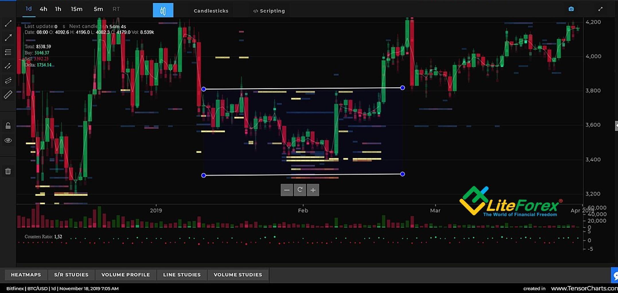
The principle of trend clustering is an important part of the VSA. For many years, traders have observed that old trend lines on a chart continue offering support or resistance for a long time after they ended. So, Tom Williams and his assistants decided to employ this property in the VSA model.
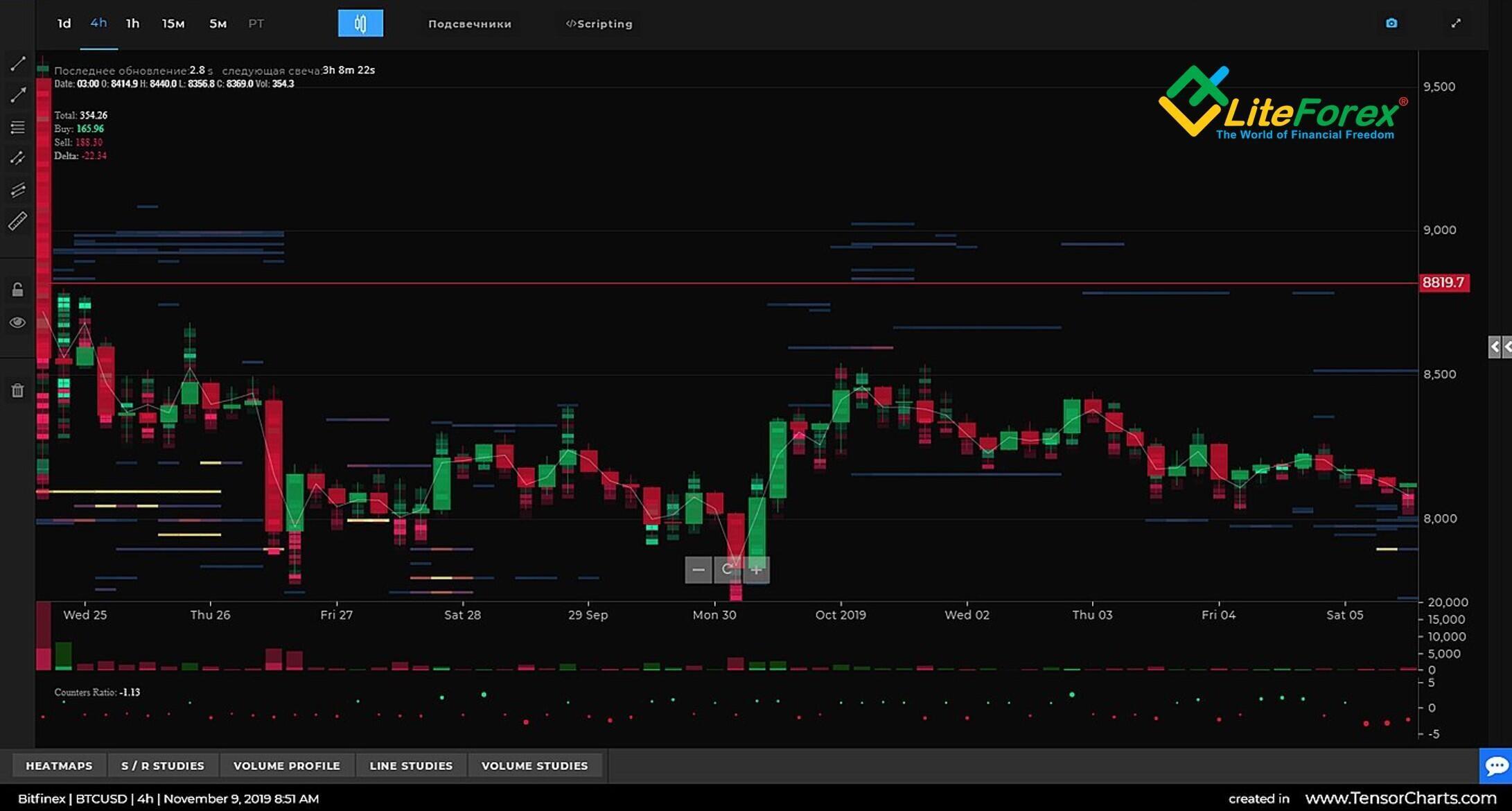
Horizontal colorful blocks on the four-hour trend clustering BTCUSD chart above are the levels of support and resistance marked by strong old trend lines that formed strong areas of support and resistance to the price. These trend lines are a few weeks old, but they can still stop the price movement unless there is enough effort made by market-makers. The most significant clusters consist of many dozens of levels, that is why they are very strong.
Using trend clusters in the VSA model
The first and most important point is that blocks are limited. Trend clusters are strong where the trends of different order are converging, and they stop where the trends are beginning to diverge. So, you must not mentally extend the line of clusters beyond their natural limits, you should consider only the blocks appearing on the chart.
The clusters offer resistance; the gaps between clusters offer an opportunity for the market-makers or specialists to take advantage of in their trading. There are moments when high natural demand coincides with the market-makers’ intention to start a bullish trend, then they can cross the resistance with the least amount of effort to them.
As a rule, before a sharp price jump, which looks like several wide spread bars or even gaps, professional traders are testing the levels trying to find out the volume of demand. So, you may see the price drifting sideways when it is getting closer to a strong trend cluster. Another marker is when the highs or the lows of the bars cross the resistance, and the price is again driven back, especially the closing price.
There is a clear sideways price movement in the BTCUSD price chart. Afterwards, professional traders break through several clusters with just a single strong movement.
Therefore, trend clusters may help us understand the intentions of market-makers when other methods provide little or no information about the current market situation. In addition, they are a kind of natural obstacles that slow down or even stop the price movement, especially on the bar closing, if the current volume is not enough to break through the resistance.
Principles of starting a bull market
Before a bull market starts, the price is falling. The asset is falling price day after, punctuated with small up-moves with lower tops until there is reached a level where will not be able to stand any more losses and will tend to sell their holdings all at the same time. As these traders sell, professional money will step in and start buying, because, in their view, the real price is higher. They can buy out the assets without putting the price up against their own buying. Differently put, this is the accumulation phase.
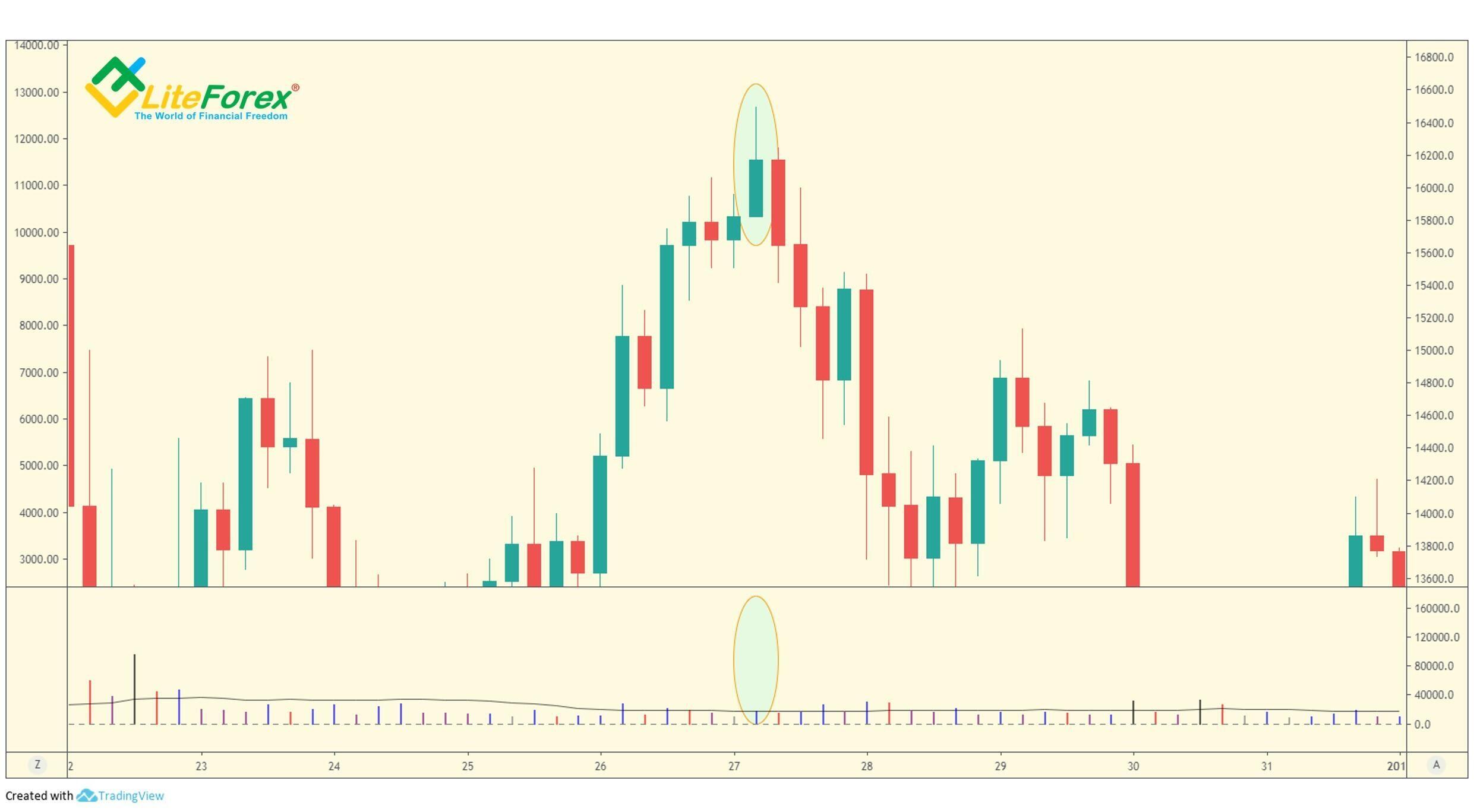
This process is going on all the time, creating either a small move or a large move. Any move that starts is in direct proportion to the amount of assets that have moved from weak holders to the hands of strong holders. The larger is the move, the more extensive is the process. Before a major bull trend starts, this process should reach its extreme, known as a selling climax, which is a major transfer of assets.
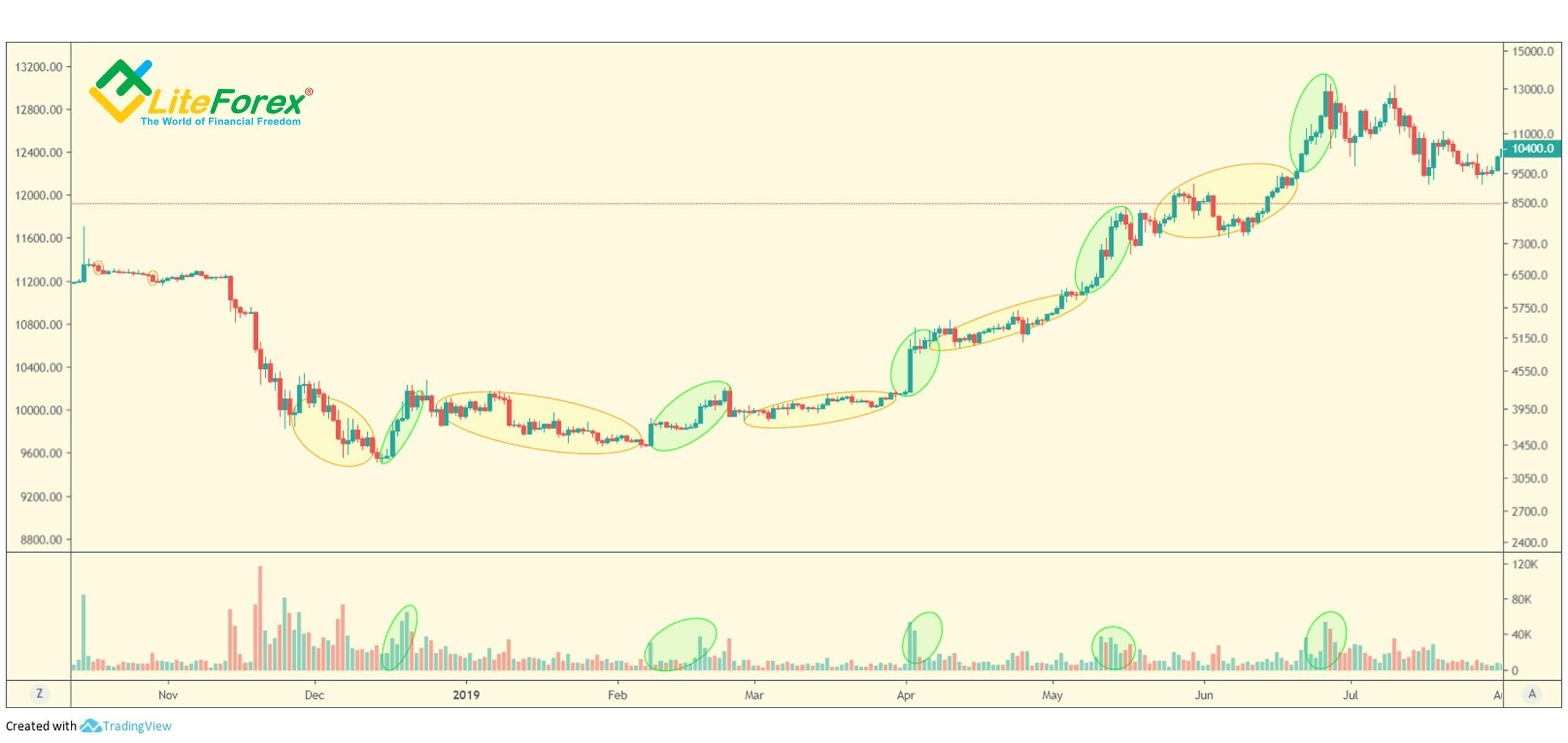
On the above chart, the selling climax is marked with the first low-volume yellow oval on the left. After the climax, professional traders make an effort to stop the bearish trend. Next, the long yellow oval marks the accumulation phase preceding the start of a bullish trend.
The accumulation phase continues after the trend reversal. Basically, the entire bull movement is a series of accumulations. The chart presents a series of accumulations and efforts of professional money with typical volume surges.
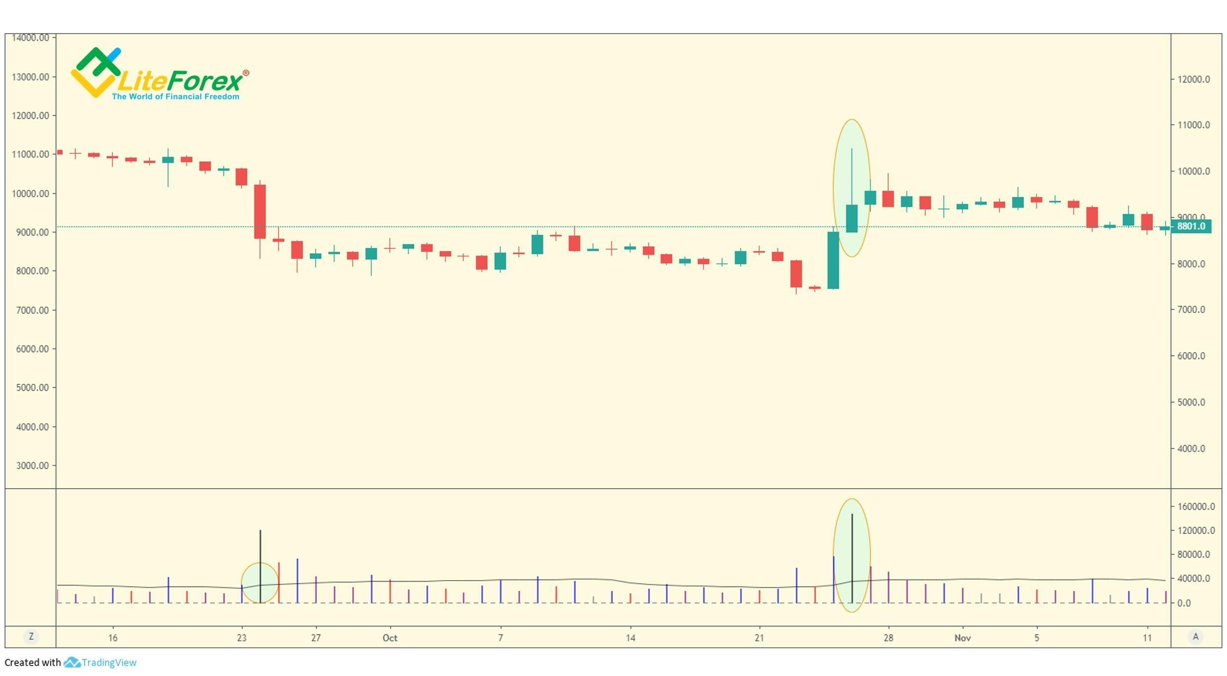
The accumulation zone is clearly visible in the analysis using trend clusters.
It is clear from the above chart that at the bottom of the trading channel, there many clusters of large traders supporting the price. Rare clusters of sellers are above.
When the accumulation phase finishes, large money breaks on the high volume through the clusters marking the resistance to the up-move, the chart paints a long rising bar.
Once the prices start moving up, ordinary traders also start buying, expecting to make profits. This results in the resistance that is not wanted by professional traders. To weaken the resistance, large traders draw the price back down again from time to time, forcing the weak holders to sell. The above chart displays such a drawdown following the effort. When the price is low enough, professional traders will again buy the asset at a beneficial price in the accumulation phase, and the bullish movement will continue. The phenomenon mostly explains the unevenness of price growth.
It should be also understood that a market moves up, not necessarily because there is more buying than selling, but because there is no substantial volume of selling (profit-taking) to stop, or at least to substantially slow down, the up-move.
A bear market mostly starts when there is insufficient buying support from the major players to stop the down-move. That is why markets fall much faster than they rise.
Once a rally starts, the price will at some point reach the level where a part of professionals may start to take profits. If the largest holders, who are members of financial syndicates, still own most of the stock and are expecting still higher prices, they will have to absorb this selling, whose pressure is strengthened by the resistance from the old trading areas; however they will be reluctant to just continue driving the price up, until they are sure all the supply at that price level has disappeared.
When this process finishes, there is little or no resistance. At this point, there will be made an effort to continue the bullish trend. This is another reason why the price movement slows or stops, as the professionals assess the current market conditions or absorb the selling.
A few ways how to recognize the likely end of a bullish trend
In the VSA model of the technical analysis in financial markets, there are five major signals that the bullish move is going to slow or even stop, they are:
- A failed test.
- The buying climax.
- Narrow spreads accompanied by high volume, which occurs on a market high, into new high ground
- High volume on an up-bar, with the next bar down, on a wide spread, closing below the low of the previous bar.
- The up-thrust.
Let us break them down.
A failed test
As you know from the previous training articles, a test is successful if it is accompanied by low volume that suggests that there is no resistance to the further price movement. Accordingly, if a test is failed, there won’t be a substantial up-move.
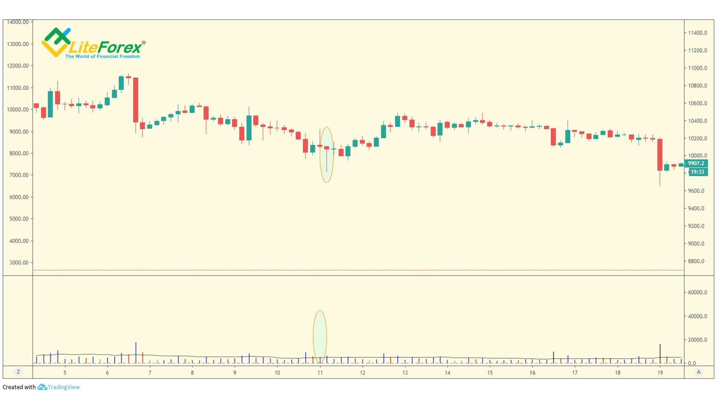
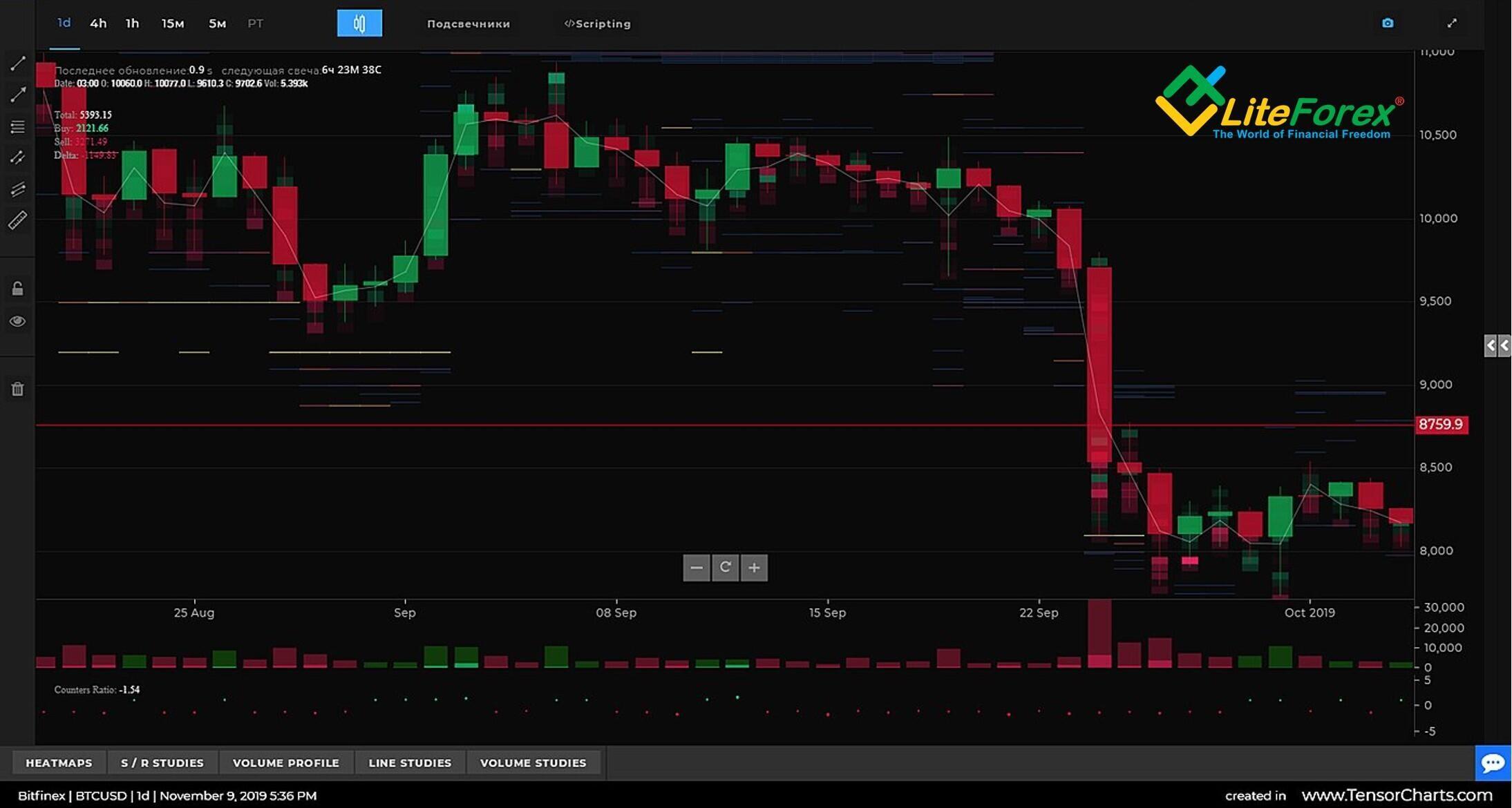
The market test is marked by a yellow area in the four-hour BTCUSD chart. The highlighted bar hits a new local low and closes near its high. Besides, the volume is not much different from the volume of near bars. So, the large traders may have a view that there are enough sellers, whose joint efforts might have been a resistance to the bullish movement. That is why the price goes up a little and starts falling soon.
A narrow spread on a market high
When the price reaches a new high, usually on good news, most of the inexperienced traders rush into the market, buying before they miss further price rises. However, few pay attention to a narrow spread, which is a signal to worry about.
This is a strong VSA signal that the specialists do not expect the price to be further rising. The good news and a new high occur to draw the buyers into the market so that the professionals will have an opportunity to sell. On an up-day, the professional money fully satisfies this demand, which results in high volume. Besides, the lack of imbalance between the demand and the supply narrows the range of price fluctuations, that is why there is a narrow spread on an up-day.
So, if the price hits a new high and there is a narrow spread with high volume, it the signal of the market weakness and there should soon start an opposite trend, or at least a sideways trend.
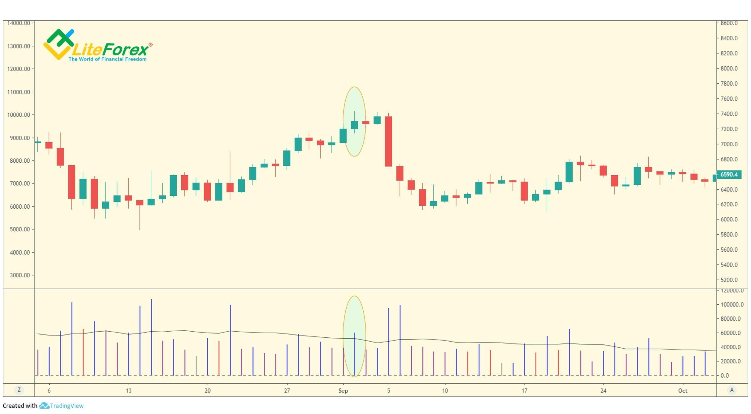
The local high is circled on the daily BTCUSD price chart. As you see the spread is narrow, but the volume is quite high. This means that professional traders are selling their holdings off to the traders, who expect the bullish trend to continue. Next, you see that after the support in the form of high demand is removed from the market, the price starts falling fast and, then, starts trading sideways.
This rule similarly operates in the bear market. If you see a new local low with a narrow spread and high volume, this may indicate that the professional money is absorbing selling to start a price rise.
High volume on an up-bar with the next bar down
An up-bar is accompanied by high volume. At this time, most traders are encouraged with the price rise and open longs. But, if the up-bar is followed with a wide spread bar down to then close below its low, it means that the bearish sentiment dominates. Therefore, either the further trend will transform into the sideways trend or a downtrend will start.
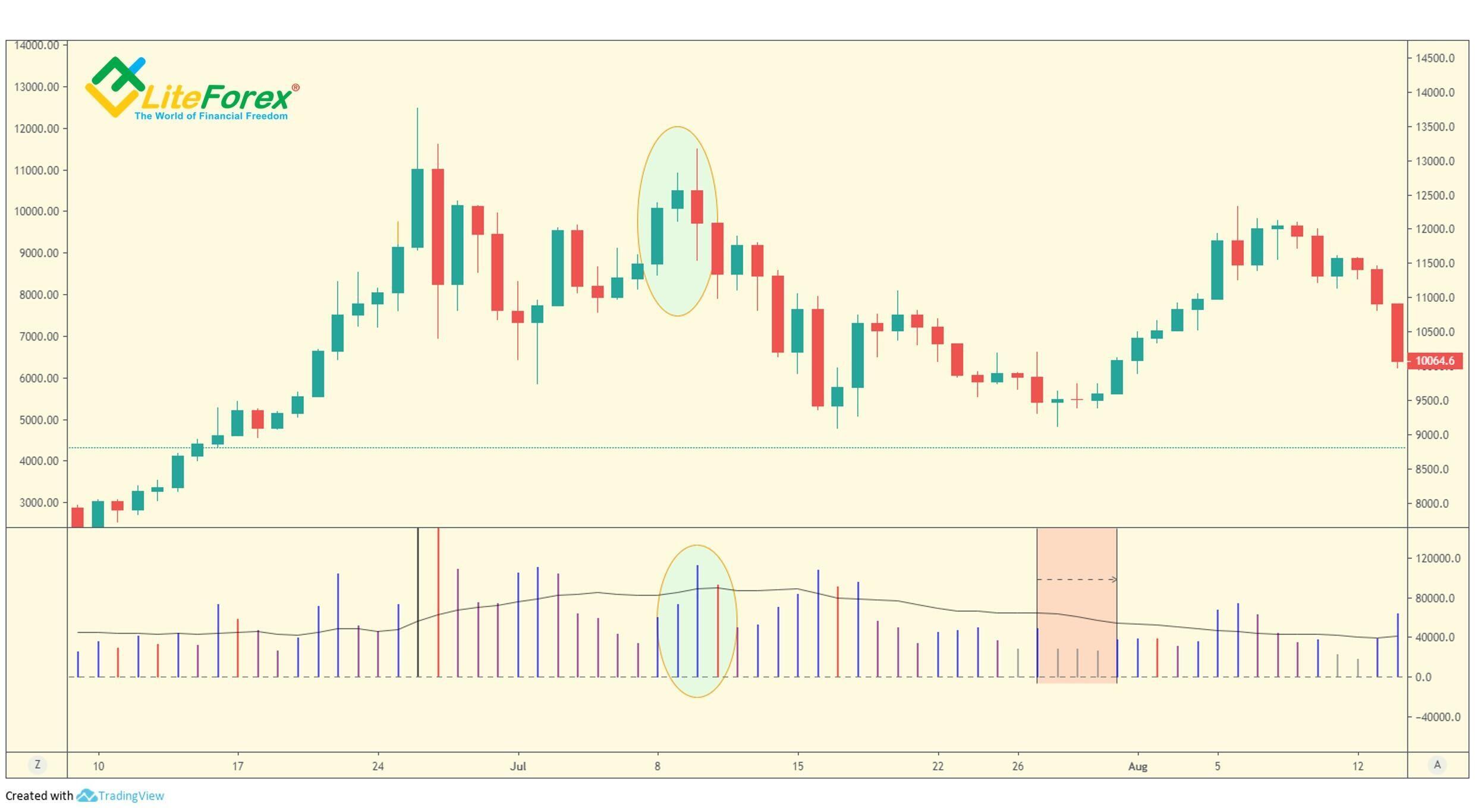
The pattern is highlighted with an oval area in the chart. The last up-bar is accompanied by high volume, which could be wrongly taken as a sign of further growth. However, the next bar is down, has a wide spread and closes a little lower than the previous close. Besides, it is also accompanied by high volume, which indicates bearish sentiment.
Up-thrusts
Up-thrusts can be recognized as a wide spread up during the day (or during any timeframe), accompanied by high volume, to then close on the low. Up-thrusts are usually seen after a price rise, at its top, where the market has now become overbought and there is a weakness in the background. Up-thrusts are frequently followed by the trend reversal.
Market-makers quite often generate up-thrusts, as this trick is a moneymaking maneuver. During a rapid rise, many weak holders are taken into buying. The highest price is held as long as possible to encourage other traders to enter longs. The further price reversal makes them catch stops or close their positions in a panic. It must be noted that when the market is known to have become weak, market-makers or specialists can mark the prices up quickly, often on good news.
On the four-hour chart, there is an up-thrust accompanied by low volume. The bar has a wide spread and closes around the low. This means that the specialists have closed their positions and are not willing to support further growth. There is a bearish trend in the next days.
This time, the chart displays an up-thrust with high volume (the bar is marked with an oval). If this rise resulted from the activity of professional money, the price wouldn’t roll back to the area of its low within the same bar. The price rolls down when selling prevails over buying, and so, the price can’t continue growing.
The Selling Climax
A selling climax is indicated by ultra-wide spreads down, with exceptionally high volume, usually closing on or near the highs of the day. This action signals the market strength and a soon start of a bull market.
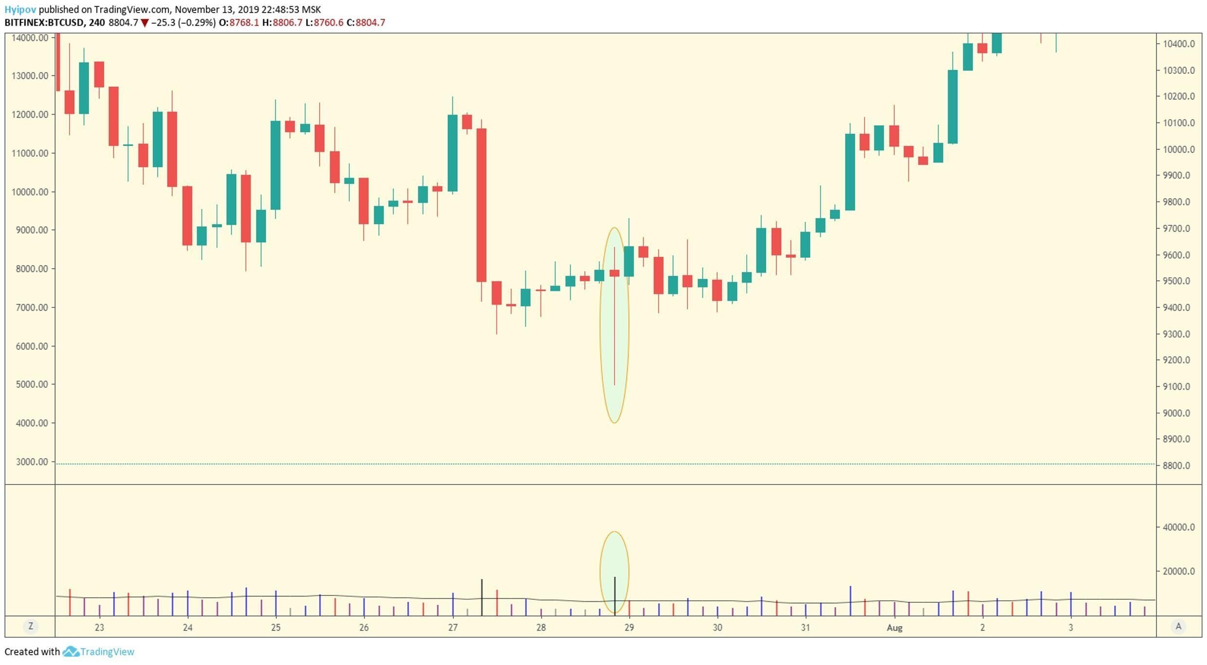
The above chart displays a wide spread down-bar that is circled in the chart. If its high volume resulted from professional selling, the bar would close around its low, as the supply and demand imbalance would accelerate the further price fall. In this case, the selling is successfully swamped by market-makers and the down-move is stopped later.
Mini selling climax, reverse up-thrust or professional support
This action is also indicated on the chart by a wide spread down-bar often going down into recent or new low ground, and then closing at or near the highs, on high volume. A more reliable sign of the reverse up-thrust is a gap down, and the following day is gapped up; however, any down-bar on low volume following this event, especially if it closes on the high of the day, is a strong indication of market strength.
The professionals absorb this selling (supply) by massive buying to stop the bear move and to accumulate assets before they can start a rally.
On the four-hour BTCUSD chart, there is a wide spread down-bar that closes around its high ground on high volume. This is a clear signal of professional support that has absorbed all selling. After the bar marked with an oval area, there is a slight market reaction to the lack of supply in the form of an up-bar. After that, the price continues falling for some time on low volume. As I wrote above, this is an indication of the market strength that further manifests itself in a steady uptrend.
Distribution phase
A strong bull market always reaches the point, where most traders can’t stand missing out any longer. They start acting in the direction that everybody else seems to be acting in, being sure that the bullish trend is strong. Their judgment is clouded by all the euphoria around them, the news is good, everybody is bullish about the market.
Uninformed traders are rushing into the market and buying in huge amounts. This rush of buying gives the traders that accumulated stocks at the lower prices, the opportunity to take profits without putting the price down against themselves. This stage is referred to as the distribution phase in the VSA model. It may be going on very fast, accompanied by a buying climax, or it can be a slower rounding over prices to encourage weak holders to buy. In the latter case, the chart will look like a mushroom top over a longer time, it takes several weeks for this phase to complete.
This slower selling is accompanied by frequent up-thrusts and the price jumps up and down on high volume. This activity can be easily explained. When the price goes down, strong holders sharply reduce the intensity of selling, and they increase it again when most traders are bullish again.
Besides, the volume on the up-moves can be either high or low. High volume shows that selling has swamped any demand. It tends to appear at the beginning of any distribution phase. Low volume shows that no demand is present and tends to appear at the end of a distribution phase.
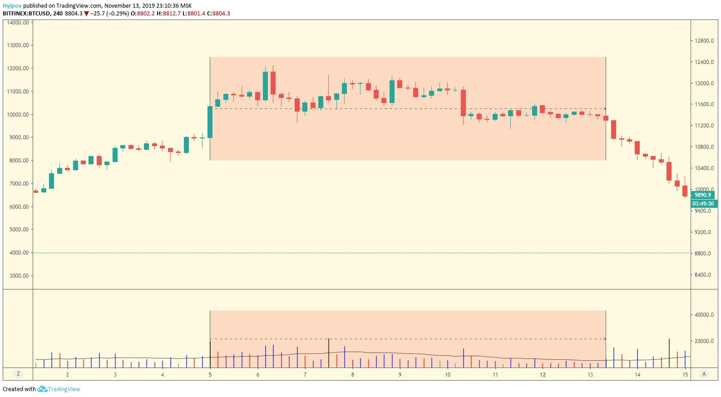
The BTCUSD chart displays an example of slow selling. During the whole distribution phase, the price is not trending, as if somebody prevents first its excessive rise, and then falling too low. Let us analyze the volume. You see that the amount of trades declines once the price starts going down. After the price reaches an acceptable level, trading activity increases again.
Besides, at the beginning of the distribution phase, when the mass demand is easily swamped by professional selling, the volume is much higher than at the end of the phase. After the asset is distributed to the weak holders, the market feels the imbalance of demand and supply which starts the bearish trend.
This all about trend clusters in Forex and the VSA method. In the next article, I will deal in detail with the principles of starting a bear market.
Subscribe to the trader blog and be on top of crypto trading!
I wish you good luck and good profits!
P.S. Did you like my article? Share it in social networks: it will be the best "thank you" :)
Useful links:
- I recommend trying to trade with a reliable broker here. The system allows you to trade by yourself or copy successful traders from all across the globe.
- Use my promo code BLOG to get a 50% deposit bonus on the LiteFinance platform. Simply enter this code in the appropriate field when funding your trading account.
- Telegram chat for traders: https://t.me/litefinancebrokerchat. We are sharing the signals and trading experience.
- Telegram channel with high-quality analytics, Forex reviews, training articles, and other useful things for traders https://t.me/litefinance
Price chart of BTCUSD in real time mode
The content of this article reflects the author’s opinion and does not necessarily reflect the official position of LiteFinance broker. The material published on this page is provided for informational purposes only and should not be considered as the provision of investment advice for the purposes of Directive 2014/65/EU.
According to copyright law, this article is considered intellectual property, which includes a prohibition on copying and distributing it without consent.