On the Internet and in various textbooks on trading in financial markets, you can find a lot of information about chart patterns and candlestick formations. Examples of such formations are mainly related to the Forex derivatives market and trading of currency pairs. This raises the question: do these patterns apply to stock charts? Of course, candlestick chart price patterns apply to any instrument, including stocks.
Price chart patterns indicate the overall market sentiment at a specific time. Existing candlestick analysis formations and stock chart patterns vary in type, but they all help determine the possible price direction. Below, we will look at the most common chart patterns used in trading.
The article covers the following subjects:
Major Takeaways
Main rule | Key facts |
Stock chart pattern definition | A chart pattern is a graphical presentation of price movement in a candlestick chart, which forms during the stock trading period and allows you to determine the further probable price movement. |
Chart patterns signals in the stock market | The formation of patterns on the price chart gives certain buy/sell signals, depending on the type of pattern. |
Stock chart patterns trading strategies | Each chart formation has trading criteria that allow you to determine a more profitable entry point, stop loss, and potential profit target. |
Chart patterns pros and cons in trading stocks | Patterns allow you to track the current market sentiment and enter a trade according to the criteria. However, all chart patterns require confirmation by other indicators or patterns. |
|
Time frames | Patterns in the stock market are formed in all timeframes, which allows opening trading positions for both the short and long term. |
Take-Profit levels | The take profits can be defined on almost all chart patterns. |
Stop-Loss levels | Stop loss for a pattern is determined according to risk management rules. Typically, the risk-to-reward ratio is 1 to 3. |
Why Are Stock Chart Patterns So Important?
Stock price chart patterns primarily reflect the psychological state of trading participants. The patterns tend to repeat themselves statistically, as they are based on human psychotypes. In general, successful trading depends 90% on psychology and only 10% on the skills of fundamental and technical analysis.
The formation of chart patterns in any time frame allows traders to employ trading strategies both intraday and in the long term. Early identification of patterns in the stock’s charts in conjunction with technical indicators helps to define more profitable entry points with the least risk.
The ultimate goal of speculation in financial markets is to make a profit. The stock market is a separate financial system with its own rules and risks. Knowing the structure of the market and understanding its psychology gives a great advantage in trading.
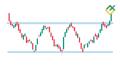
What Are The Types of Stock Chart Patterns?
There are two main types of stock chart patterns: trend continuation and trend reversal patterns.
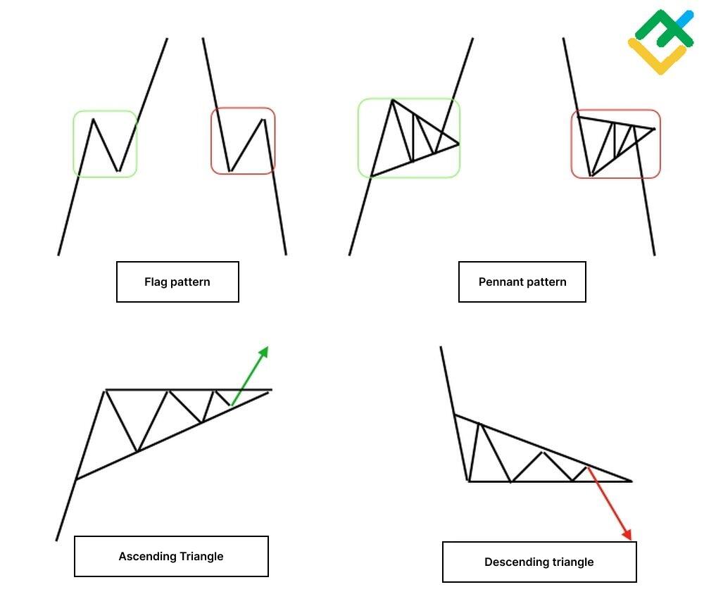
Continuation patterns
Trend continuation patterns are stock chart patterns that signal the continuation of the ongoing trend. These include bullish flag and bearish flag, pennant, ascending triangle, and descending triangle. These patterns occur in the middle of the trend; the price usually breaks out the pattern and goes along the trend in the same direction.
Reversal patterns
Reversal patterns form at the end of a trend and signal its reversal. Price breaks out these patterns and moves in the opposite direction, confirming the trend direction's final change.
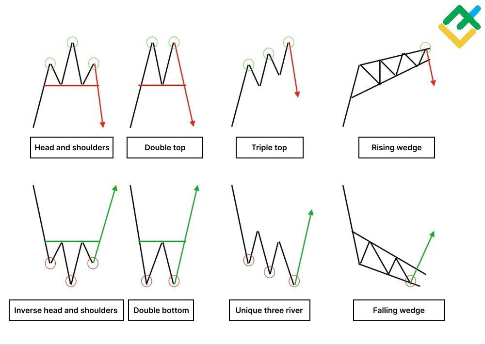
Some of the key bearish reversal patterns include such patterns as head and shoulders, a double top, a three mountains (a triple top) pattern, a rising wedge, and others. These patterns usually signal that the asset may no longer be rallying and that lower prices may be on the way. The formation indicates growing selling pressure and a soon end to the uptrend.
Such chart stock patterns as a double bottom, three rivers, inverted head and shoulders, and falling wedge, on the contrary, indicate a soon bearish-to-bullish trend change.
Best Stock Chart Patterns
There are quite many chart patterns in the stock patterns, but only a number of them are most commonly used in trading. These patterns are convenient and practical and frequently occur in all timeframes. These patterns make it easy to find profitable entry points and calculate potential price movements.
Ascending Triangle
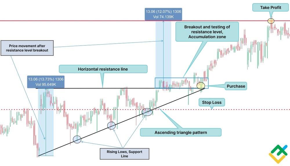
The Ascending Triangle is a technical analysis chart pattern that warns of a continuation of an uptrend and is formed in the middle of a price movement. In some cases, after a prolonged decline in an asset, a pattern may form at the bottom as a bullish reversal pattern.
The upper line of the pattern forms a horizontal line - a resistance level. At the same time, the lows gradually increase, forming an inclined support line. The ascending triangles give accurate signals in longer timeframes starting from H4.
It should be emphasized that the model has its own trading criteria and takes quite a time to complete. However, its appearance in the chart gives a high probability of good profits. Let's look at an example of the ascending triangle below in the four-hour chart of PayPal Holdings Inc. shares.
When the ascending triangle completed, the stock price broke out the upper boundary of the pattern. The price tested the broken-out level for some time, consolidating in the sideways channel. After the price finally consolidated, the bulls pushed it higher, breaking through the accumulation channel.
According to pattern trading, a long trade is entered after breaking the horizontal resistance line. To determine the potential profit target, it is necessary to draw a vertical line from the lower border of the triangle to the maximum price on the resistance line. Next, this line must be moved to the breakout level and directed upward.
The endpoint of the segment will be considered a potential take-profit level. In this case, it is advisable to set the stop loss in the middle of the formed pattern so that the risk of loss to profit ratio is 1 to 3.
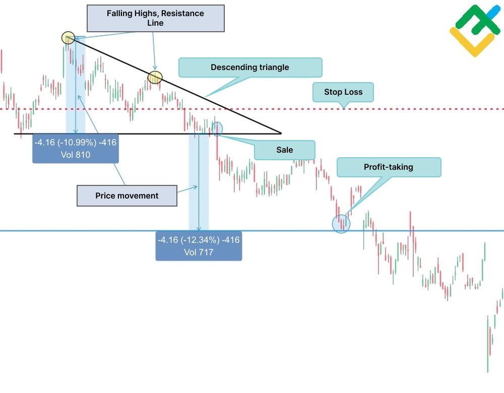
Descending triangle
A descending triangle is a price pattern that usually occurs in a downtrend and warns of its continuation. In some cases, a descending triangle could appear at a high of an uptrend, signaling its exhaustion and price reversal down.
The “descending triangle” is the exact opposite of the “ascending” triangle. The pattern forms a horizontal support level and an inclined resistance line with decreasing highs.
Let's analyze pattern trading in the daily chart of Pfizer Inc. securities. The picture below shows that the asset price has drawn a descending triangle structure. After a long downward consolidation, the price broke the lower boundary of the impulse candlestick pattern. In this case, to determine a more profitable short entry, you can use shorter time frames, for example, H1.
The price movement along the pattern is determined by the price projection from the maximum point of the pattern to the support level. Next, this projection is shifted down from the broken-out support level. The endpoint of the vertical line will be a potential take-profit level. According to pattern trading rules, stop loss is set above the support line so that the risk-to-profit ratio is approximately 1 to 3.
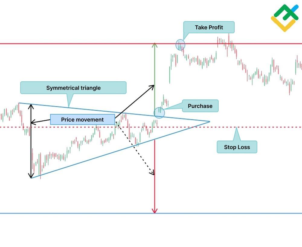
Symmetrical triangle
The Symmetrical triangle is a trend continuation chart pattern formed as a symmetrical formation. Some traders classify symmetrical triangles as bilateral patterns, that is, chart patterns that signal a stock price can move in either direction. During the formation of the symmetrical triangle, the price consolidates within the boundaries of the support and resistance lines, intersecting at one point.
Note that the lows are rising in symmetrical triangles while the highs are decreasing. If you draw support and resistance lines, you can see that the pattern resembles an isosceles triangle, the apex of which is on the right. After accumulating an asset within the pattern, the price usually breaks out the line in the direction of the associated trend.
If a symmetrical triangle occurs in a bullish trend, one should wait until the pirce breaks out the upper boundary of the pattern. If the pattern forms in a downward trend, a breakout of the lower border should be expected.
However, be careful, as rising lows and falling highs can signal equal strength between bulls and bears. A line breakout in the opposite direction signals a trend reversal for the instrument.
The figure below shows an H4 chart of Adidas AG shares, where a symmetrical triangle pattern has formed. According to the chart pattern, price movement is determined by the distance from the minimum point to the maximum. Next, the price projection is shifted to the breakout point, in this case, upward. The endpoint of the measured line will be an approximate guideline for the take-profit level.
The stop loss is set below the resistance level or above the support level, depending on the breakout point. In our case, opening a long position and placing a stop-loss order below the resistance level was relevant.
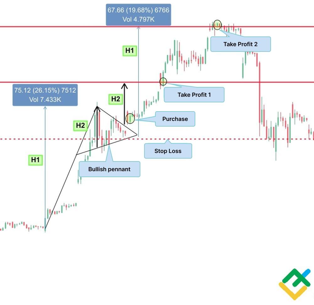
Pennant
A pennant is a trend continuation price pattern that forms in the middle of an upward or downward movement. Often, traders, especially beginners, confuse a pennant with a symmetrical triangle.
The pattern can be detected after an active price growth - a flagpole, after which the security quotes consolidate in a narrowing sideways corridor resembling a triangle.
Unlike the triangle, which takes a long time to form and most commonly is spotted in longer timeframes, the pennant pattern can be traded intraday, using shorter time frames from M15 to H1. An example of a bullish pennant can be seen in the hourly chart of Tesla Inc shares below.
After an active phase of price growth, the bulls took a pause and the price of the technology giant stock consolidated in a narrowing sideways channel. Then, the price broke through the upper border of the pennant, forming a gap, and headed higher. The potential price movement here can be measured in two ways:
movement equal to the height of the flagpole,
movement equal to the height of the pennant.
A long position, in this case, is opened when the price breaks out the upper border of the pennant. In the event of a bearish pennant formation, everything happens the same, only in the opposite direction.
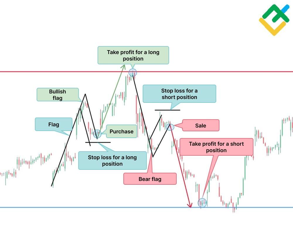
Flag
The flag is a bullish continuation pattern. After an impulse price movement, a flagpole is formed. Further, the movement along the trend stops, and the price corrects in the opposite direction, forming the upper and lower boundaries of the flag. Sometimes, the price correction can take a horizontal form.
Traditionally, the flag is constructed in the form of a rectangle but can also take the form of a wedge. After the corrective movement, the price exceeds the border in the direction of the prevailing trend. It should be noted that during the flag patterns construction, trading volumes decrease. When the flag pattern is broken out, the volumes grow, giving the price impulse.
A position should be opened when the pattern is broken out. The potential profit level for the pattern is determined by the height of the flagpole. The measured segment is projected to the price breakout level in the direction of the associated movement. The stop loss is set outside the pattern borders:
In the case of a bullish flag, a stop loss is set below the lower border of the pattern;
In the case of a bearish flag, a stop loss is set above the upper border of the pattern;
The flag can be found on any timeframe, which allows you to enter short-term and long-term trades. Let us look at an example of a flag chart pattern in the daily chart of the Alibaba Group Holding Ltd stock below.
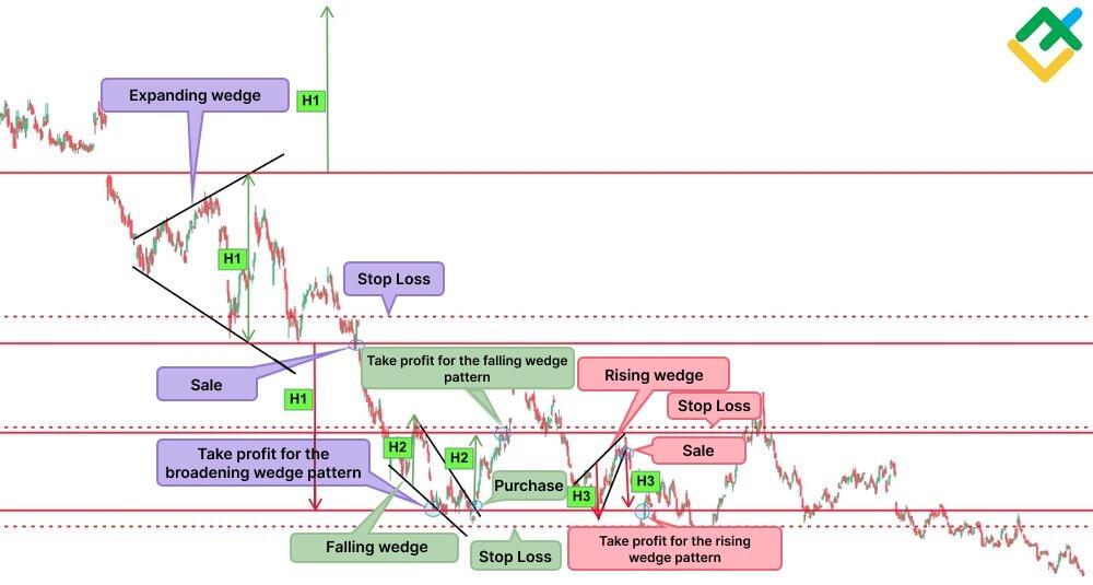
Wedge
A Wedge pattern is a trend reversal pattern. The price fluctuates in a narrowing or widening channel, forming price highs and lows. In some cases, a wedge could indicate the trend continuation. Types of a wedge include
Rising wedge,
Falling wedge,
- Expanding wedge.
All these wedge patterns can be formed both at the high or the low of the trend. Each of them has its own trading conditions, which can be used to determine the entry point, stop loss, and potential take profit level.
The support and resistance lines of the rising wedge and falling wedge have a common slope in the same direction, while for the expanding wedge, the borders of the channel are directed in different directions. The size of the initial stock movement is measured by the projection from the minimum to the maximum point of the wedge.
It must be emphasized that the price exit from the expanding wedge can be in one of the directions, while for the rising and falling, the price exits only in the direction opposite to the slope of the wedge. Therefore, like any other price pattern, the wedge must be confirmed by candlestick patterns and technical indicators to determine the strengths of the price formations.
The types of wedges found in stocks are illustrated below in a four-hour chart of the Walt Disney Company as an example.
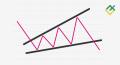
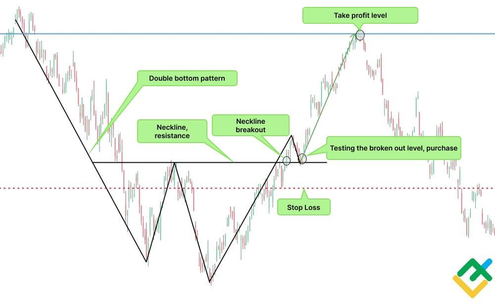
Double bottom
The double bottom pattern is a common bullish formation in the price charts of different trading assets. This chart pattern is built at a trend low, forming two bottoms. It signals that after a long downtrend, the asset turns upward, reaching the nearest key resistance. Traders call this resistance the neckline. Having reached the resistance, the price goes down again and forms a second bottom. After an unsuccessful bears’ attempt to press down the price, the instrument’s quotes turn upward and head towards the neckline, breaking it out.
A double bottom pattern can be used in any timeframe: for short-term trading and for long-term investment. Let us see an example of a double bottom chart pattern in the H4 timeframe of the Apple Inc. stocks.
Having drawn the double bottom pattern, the price broke out the neckline and consolidated above. It means that the price tested the broken-out level. A long position should be open above the resistance level when the strength of the uptrend is confirmed.
Potential price movement can be calculated by a projection from the base level in the area of two bottoms to the neckline. The stop loss is placed below the breakout point of the resistance line according to the risk management rules.
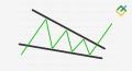
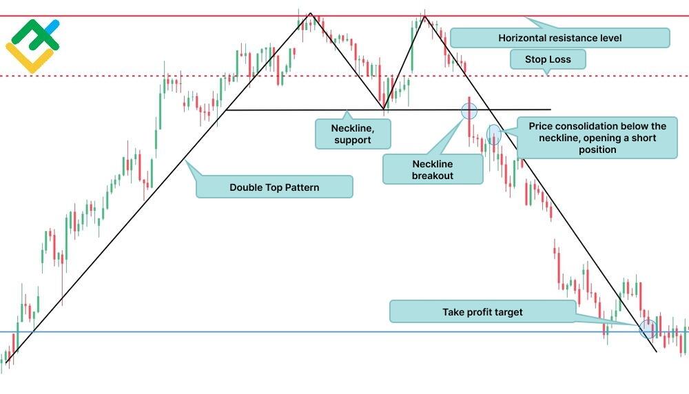
Double top
A double top pattern is a bearish reversal pattern that forms at a high of a downtrend. This bearish pattern warns traders about the trend reversal down.
After a long bullish price movement, the first top is formed in the area of the local resistance level. The price then corrects down to the nearest support level. Next, the asset quotes bounce up, restoring the price back to the horizontal resistance level.
Following some trading time, the asset price finally turns down. A breakdown of the support line signals a complete trend reversal down. After the price consolidates below the neckline, one could enter a short trade. A stop loss is set above the broken-out level.
The approximate price movement is determined by a price projection from the support line to the level of two tops. But often, such a pattern is worked out almost all the way to the bottom, where the price began to rise. Below, you can see an example of a double top pattern on the hourly chart of Google Inc.
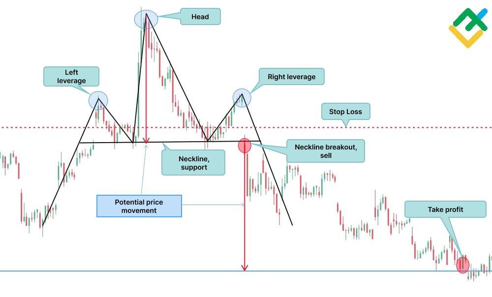
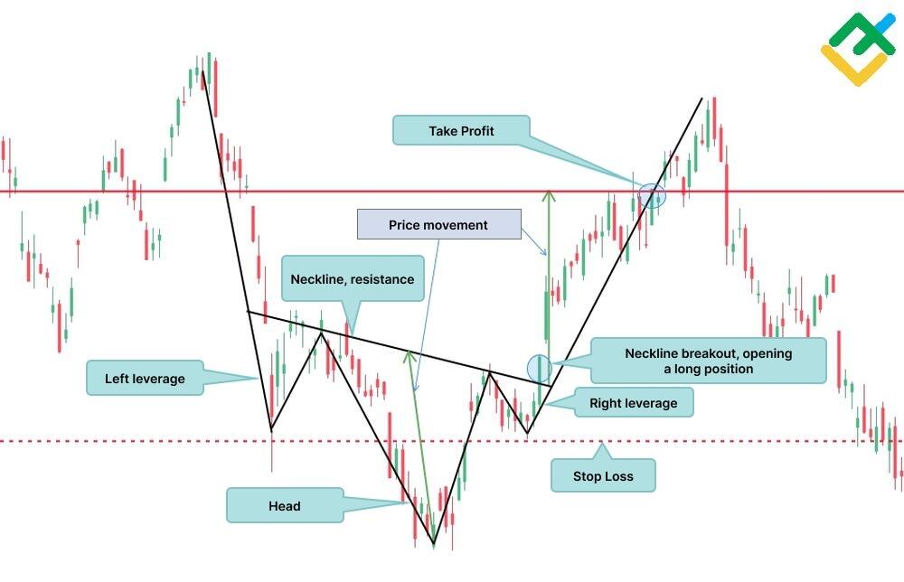
Head and shoulders
The head and shoulders pattern is one of the key bearish reversal patterns appearing at the peak of an uptrend. The pattern starts drawing in an uptrend and finishes already in a downtrend.
First, a stock’s price draws a left shoulder in an uptrend. The price rises almost straight, after which it corrects to the nearest strong support level, that is, the neckline. Then the market turns up again, forming the second peak, the second head. This is the highest level before the final price reversal downwards.
After the reversal, the price reaches the neckline again. Next, the market draws the second shoulder at approximately the same level as the first one. It should be emphasized that the high of the second peak may be higher than the high of the first peak. Next, sellers finally seize the initiative and drive the price down to the neckline, which is broken out.
A short position in the head and shoulders pattern must be opened below the broken-out level or after testing the neckline. The potential size of a further decline can be determined by a projection from the highest point of the head to the support level, that is, to the neckline.
A stop loss is set above the neckline. Let's look at an example of a head and shoulders pattern in an hourly chart of the Microsoft Corporation stock.
Rounding top or bottom
The rounding bottom pattern (a saucer) is a price chart pattern that indicates the beginning of a bullish trend and is formed at its low. The Rounding Top pattern is the opposite of the Rounding Bottom pattern, which signals the start of a bearish trend and forms at local highs.
The structure of both figures resembles a semi-oval formation, which is where the name comes from. It also resembles another technical pattern, Cup and Handle, but in this case, there is no handle. In Japanese candlestick analysis, these reversal patterns are called a Tower bottom or a Tower Top.
Let us look at an example of a bullish rounding bottom chart pattern analysis in the H4 chart of Coca-Cola Company stocks. The price reaches the support level and draws a rounding bottom pattern, signaling the trend reversal.
Trading conditions for the pattern are quite simple: first, you need to wait until the price breaks out the resistance line, which is part of the chart formation. After the price has consolidated above, you can open a long position.
The target profit is determined by a price projection from the support line to the broken-out resistance line of the pattern. Next, this projection, directed upward, is transferred to the price breakout level. The endpoint of the segment is a potential profit-taking level. The stop loss is placed below the broken-out resistance level.

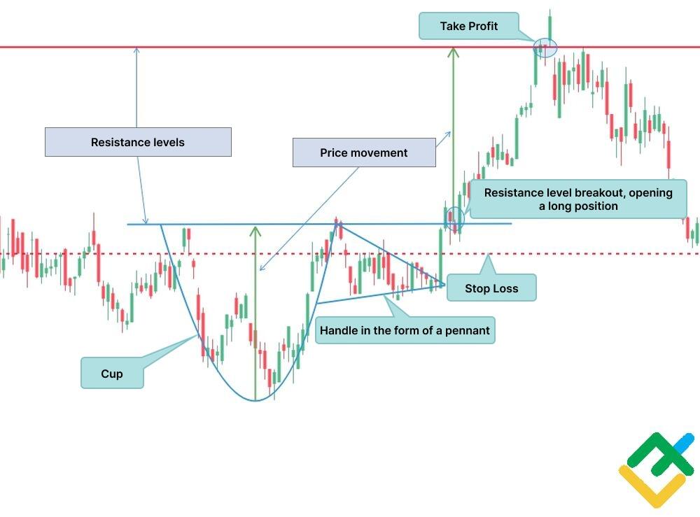
Cup and Handle
The Cup and Handle pattern is a trend continuation pattern and has a very interesting structure, as is clear from the name itself. The figure warns market participants about a change in the balance of power towards buyers and signals the possibility of opening long positions.
The cup and handle pattern differs from the rounding bottom pattern only by the presence of a handle in the form of a bullish pennant or flag. After its construction, the price impulsively breaks through the resistance level.
You can open a long position after the price consolidates above the resistance level. The potential Take Profit level is measured as in the previous formation. An example of a cup and handle pattern is shown below on the four-hour chart of AT&T Inc. stock.
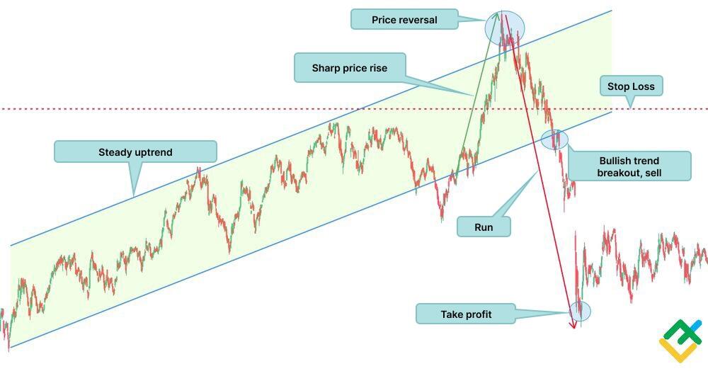
Bump and Run
Bump and Run is a reversal pattern that occurs in an uptrend following a price rise. The pattern formation could be divided into three stages:
A phase of sustained upward movement when the price rises smoothly. The upward trend has a slope of 30-45 degrees.
The Bump phase. At this stage, the trend takes on an aggressive character, and the angle rises to 45-60 degrees. This happens due to excessive speculation in the market.
- The Run phase. After the price reaches its maximum, it reverses, returning to the trend channel and rapidly breaking through it downwards. The trend boundary broken by the bears automatically becomes a resistance level for the bulls, and the prevailing downward trend in the asset intensifies.
Short positions can be opened either from the peak level after a sharp increase or after a breakout of the lower boundary of the uptrend. The stop loss is placed above the local price high, which formed after a sharp increase or above the trend line, respectively.
The target profit should be adjusted using candlestick formations, chart patterns, and technical indicators since “big shorts” are occurring in the market at this moment. Below is an example of a bump and run pattern on the daily chart of the shares of the German automaker Volkswagen AG.
Inverse Head and Shoulders Pattern
An inverse head and shoulders pattern is a bullish peer of a common head and shoulders formation. The pattern occurs in a downtrend and signals a soon reversal up.
Following a downtrend, a left shoulder forms, after which the price goes up to the neckline. Next, the price movement reverses and draws the second low, the inverse head. Next, the price reverses again and goes up to the neckline, and draws the right shoulder after that. When the pattern is complete, the price breaks out the neckline, the resistance level. Wait for the price to consolidate above the resistance line to enter a long trade.
The price movement is measured in the same way as in the usual head and shoulders. The difference is that an inverse H&S pattern is bullish, and the price projection is set at the breakout level upwards. The endpoint will be an approximate take profit level.
The stop loss is placed below the broken-out resistance level. You can see an example of such a pattern below on the daily chart of Siemens AG stocks.
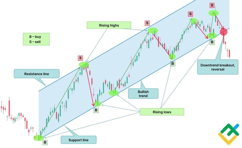
Price Channel Pattern
A price channel is the movement of asset quotes between two trend lines. The price fluctuates from the support level to the resistance level and back in an upward, downward, or sideways trend, which makes it possible to enter many trades in both directions.
The bullish price channel pattern is determined by the first two points of rising lows and the first high point on the support and resistance lines, respectively. The bearish price channel pattern is determined by the first two points of decreasing highs and one point of low price. The key feature of this model is that it allows you to earn money in two directions with a minimum time. The price channel is formed on any timeframe so that you can use both scalping and day trading strategies.
An example of a price channel with the opening of long and short positions is shown below on the daily chart of IBM Corporation stocks.
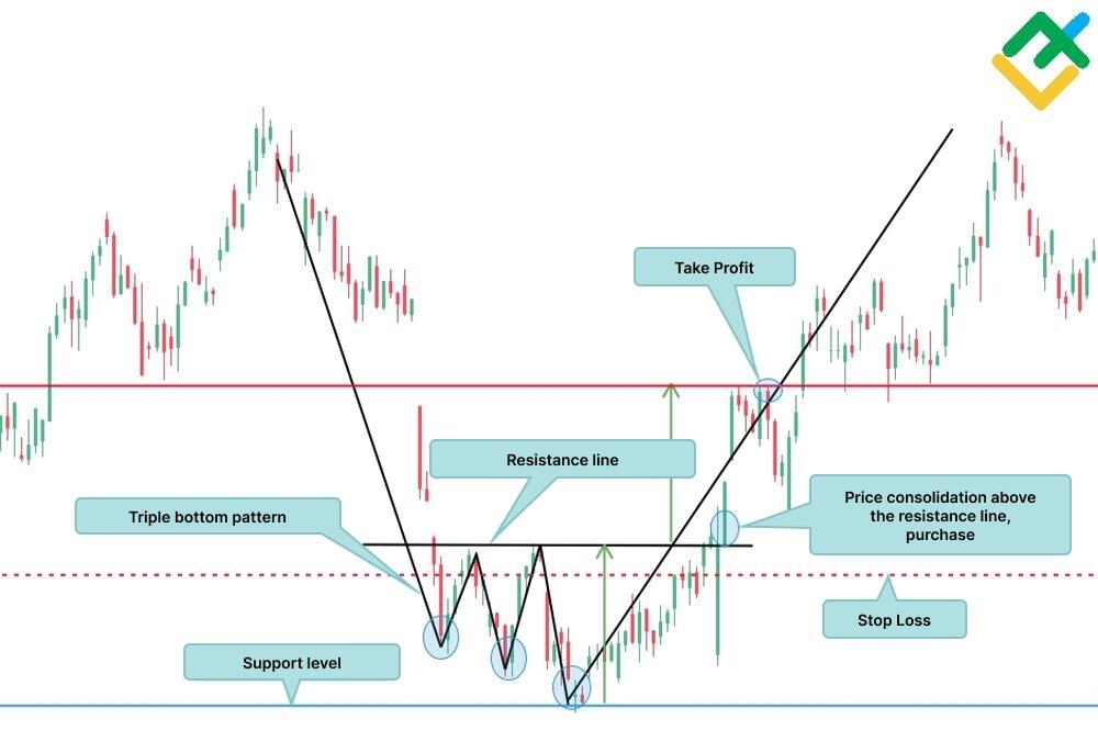
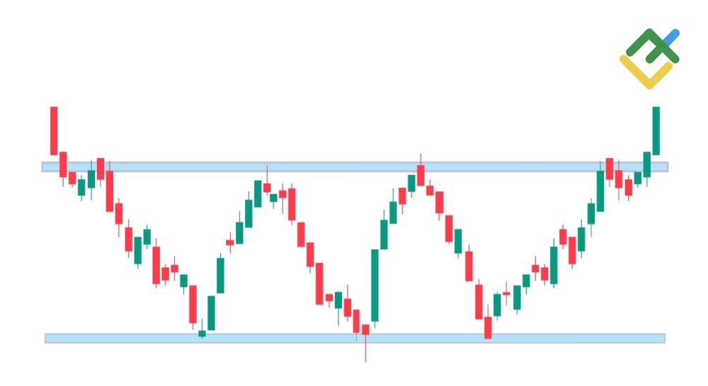
Triple Bottom Reversal Pattern
The triple bottom is a rare technical analysis pattern that forms at the bottom of a downward trend and signals a trend reversal up. The bottoms of this pattern should be formed at approximately the same level, but due to the irrationality of the market, this does not always happen.
Below is an example of a triple bottom pattern in the chart of Cisco Systems, Inc. stocks, which formed a sloping line of three bottoms and turned the price up. Such pattern formation can occur in the market and help in identifying trend reversals. Trading volumes usually decrease during the pattern construction and increase when a resistance level is broken out.
The final confirmation of the pattern is a breakout of the resistance, which is connected by a line at the highs of the bottoms. After the breakout, a long position is opened, and the size of the take profit is determined using a pre-measured distance - a vertical line drawn from the support level to the resistance level. The stop loss for the pattern is set below the breakout point according to the rules of risk management.
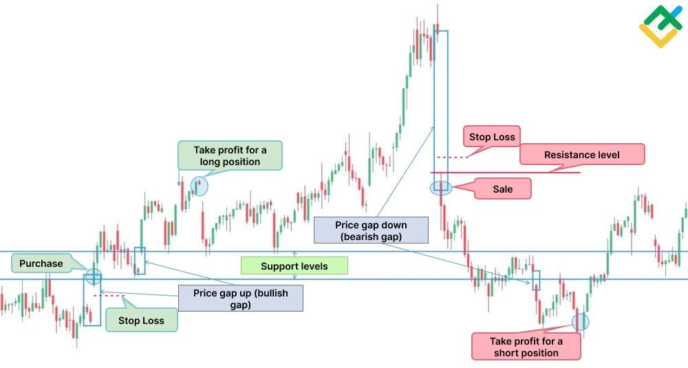
Gaps
A price gap can occur during a strong move or after a market pause. It can be easily defined in the chart. The next candlestick in the chart opens higher or lower than the closing price of the previous candle.
Gaps usually mean a breakout of support and resistance levels. In addition, a gap may form in the opposite direction to the trend, which will signal a trend reversal.
The figure below shows examples of bullish and bearish gaps in the hourly chart of Netflix Inc. The first upward price gap broke through the resistance level, and the price consolidated higher, which made it possible to open a long position, placing a stop loss below the resistance line. Then, the price formed another gap, which gave a signal for the continuation of the uptrend. Then there was another upward gap, but it was covered by a downward gap after the bulls had tried to continue the price rise. This was the signal to close the position.
Following a sideways trend and a sharp rise, there appears a large bearish gap. The price gap became a block of resistance for the bulls and meant a price reversal. A short position could be opened after a downward gap by setting a stop loss above the resistance level. Next, another downward price gap formed, which signals the continuation of the asset downtrend. Once the quotes reach the key support line, where two bottoms have formed, it is necessary to close the position.
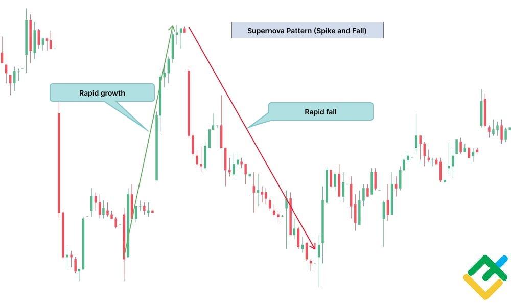
The Supernova
The Supernova pattern is a favorite pattern among penny stock traders because it is more commonly seen on the charts of low-priced securities. The pattern is most suitable for an intraday strategy with a time frame up to H1 or scalping in shorter time frames up to M15.
The pattern works on the principle of Pump and Dump and provides an opportunity to make quick money.
First, the bulls set a large number of orders to buy at the market price, pushing it up. Then, the stock is dumped and falls rapidly.
The pattern is quite risky and unpredictable, so you should be careful when using it. Below is an example of a supernova pattern in the hourly chart of Chimera Investment Corporation stock.
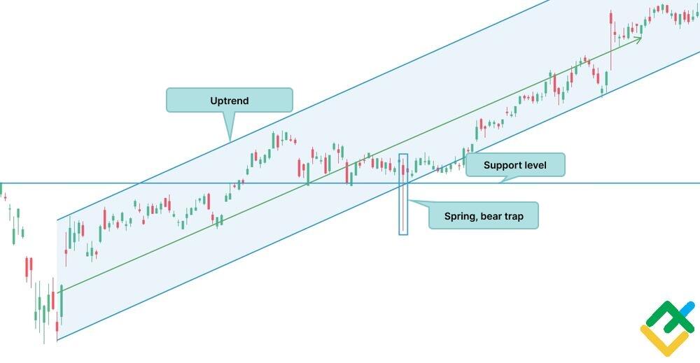
The Spring
Spring pattern is a false breakout of the support level, following which a candlestick with a long shadow appears. Market participants are led into a Bear Trap by giving a false sell signal and a breakdown of support. Then, by the end of the trading session, the price recovers back to the support level and continues to grow. Traders who open short positions without confirmation of a breakout lose their funds and remain at a loss.
How to Read Stock Chart Patterns
Each technical analysis pattern has its own formation criteria that you need to know. It is important to trade with the trend in which candlestick patterns and price action develop. Below, you can find a step-by-step guide to analyzing stock chart patterns:
First, one should choose the trading instrument and define the current trend for it.
After this, you need to set key and local support and resistance levels. This is important because most trading comes around these levels.
Next, you should spot a pattern in the chart and determine its trading criteria.
It is important to pay attention to the formation of candlesticks, their lows and highs, and how the previous candles closed.
After analyzing the pattern and determining the entry point, stop loss, and take profit levels, you need to wait for the price to break out.
It is necessary to wait for confirmation of the breakout. This can be done using candlestick patterns and technical indicators. The more confirmations a pattern has, the stronger the signal.
After the pattern signal has been confirmed, you can open a position with previously known parameters.
Analyzing stock chart patterns requires both theory and practical experience. Trading on a demo account will allow you to create and practice your own trading strategy.
Conclusion
Technical chart patterns in stock trading are a great tool for entering profitable trades. Knowledge and practical experience of making transactions based on price patterns will help you build a personal effective trading strategy.
There are a large number of such patterns in technical analysis, but this does not mean that you need to know them all. To begin with, it is enough to select several chart patterns that are formed more often than others on stock charts. These patterns are important because they reflect market sentiment and psychology, which allows trading participants to predict future price movements more accurately.
You can try trading using security patterns for free in a convenient and multifunctional LiteFinance web terminal.
Stock Chart Pattern FAQs
Shares of big companies with large capitalization are the most profitable in trading since the size of the move of one point and the volatility of the instrument are large. This allows you to enter profitable trades with a short execution period.
Yes, the stock’s price chart pattern often works. Patterns reflect the current trading conditions and the overall market sentiment, giving a good opportunity to make profits.
The easiest way to see emerging patterns on a chart is to use chart drawing and analysis tools. That is, you can easily determine the trend, resistance, and support levels and chart patterns of stocks by marking them with segments, lines, and other tools. You can find these and other tools in the chart toolbar.
It all depends on the scale of the chart and its timeframe. For example, on a daily chart, you may find head and shoulders patterns, which may consist of a flag or pennant. By zooming in the chart within the head and shoulders pattern, you may discover other patterns.
It is individual. Each trader chooses a specific chart convenient for analysis. The most popular is the candlestick chart since candlestick patterns can also be analyzed along with the stock price patterns. Japanese candlesticks often provide profitable entry points.
Almost all bullish patterns have their antipode in the same form, only in reverse. Therefore, we can say that any pattern is effective in its own way and, in one case or another, can be more or less bullish.
Yes, trading patterns on stock charts are certainly profitable if you have your own trading strategy and adhere to the rules of money and risk management.
Stock chart patterns represent certain price structures that determine the further possible movement of quotes and give traders the opportunity to make money from the price movements.
There are numerous chart patterns in stock charts; it is impossible to count the exact number. However, there is a list of the most popular and effective chart formations. The key chart patterns are described in this article.
There are several types of charts in the 21st century. There are candlestick charts, line, or bar. Candlestick charts are considered the most popular and convenient to use.
A wedge is a trend reversal pattern in which the price movement occurs between two narrowing lines of support and resistance. At the end of the pattern, the price breaks through the support or resistance level, depending on the type of wedge.
A bullish pattern is a formation that signals the start or continuation of an uptrend. A complete bullish pattern in the chart warns trading participants that the market situation is under the control of buyers and long positions should be considered.
The content of this article reflects the author’s opinion and does not necessarily reflect the official position of LiteFinance broker. The material published on this page is provided for informational purposes only and should not be considered as the provision of investment advice for the purposes of Directive 2014/65/EU.
According to copyright law, this article is considered intellectual property, which includes a prohibition on copying and distributing it without consent.