Trading strategy based on Thomas DeMark tools and my own experience. Conditions. Entry/Exit rules. Trading signals.
Dear friends,
I present my own original trading strategy that combines Thomas DeMark's technical tools and some of my own developments.
I will explain how to use the indicators, described earlier, in conjunction. Based on this strategy, I will further make my short-term Bitcoin price forecasts, which I strongly suggest subscribing to.
If you haven’t read all my training articles devoted to Thomas DeMark's studies, here is a full list of them:
- TD Trend Factor and TD Propulsion (see here).
- TD Retracements (see here).
- TD Lines of demand and supply.
- TD D-Wave (see here).
- TD Sequential and TD Combo (see here).
- TD REI and TD POQ (see here).
- TD DeMarker 1 and 2, TD Pressure, TD ROC, TD Alignment (see here).
- TD Moving Averages (see here).
- TD Range Projection (see here).
- TD REBO and TD Channels (see here).
- TD Differential, TD Anti-Differential, TD Reverse Differential (see here).
- TD Waldo Patterns: (see here).
Let us start!
Time frames
Even if you prefer trading in a single timeframe, I don’t recommend making forecasts based on a single chart. Long-term timeframes help you identify global trends that can be just unclear on daily charts, let alone the shorter ones. However, short-term chart provides a detailed information on the local market situation, which is very helpful when you analyze extreme points.
In addition, not all DeMark indicators equally efficient in all timeframes. For example, the Differential arrows quite accurate in predicting the prices just for the next bar. So, the TD Differential will be efficient only in short timeframes. Will deal with recommended timeframes for each tool applied in the strategy further.
In practice, I analyze three time periods in my strategy:
- Monthly timeframe is used to identify long-term trends and understand the general market sentiment.
- Weekly period is good for identifying pivot points, patterns, trend continuation signals. I also use it to validate the signals discovered on the monthly time frame.
- Daily timeframe is a perfect time period to define the entry/exit points. The signals discovered in longer timeframes are often confirmed in the daily chart, when the price starts moving in the anticipated direction. Or, the daily chart may suggest an opposite situation to that has been forecast; in this case, we can say that the signals discovered can be interpreted differently.
If you prefer shorter investment horizons, you can add H4 and H1 timeframes to the above list. Most DeMark's tools usually have little effect in shorter timeframes.
Indicators
It makes no sense to apply all the tools described in the previous articles. This will take much time, but to make up an accurate forecast, you will need matching of the signals sent by three or four indicators. Therefore, I will apply a few indicators, selected according to three criteria: ease of use, efficiency and universality. I have the following set of tools:
- TD Moving Average I;
- TD Moving Average II ROC indicator;
- Analysis of trend (monthly and weekly timeframes)
- Pivot point
First of all, I need to identify the ongoing trend. Unlike in classical analysis, I focus only on the most recent bars. As Tom DeMark's method suggests using the most relevant data, so, I will follow the author’s recommendations and analyze the few last bars to identify the trend.
Build trend lines
Trend line is drawn according the high of the last closed bar and the true high two bars ago. Remember, a true high must be higher than the most recent high and higher than the previous close. Next, I build the level that is called the trend strength, based on the lows of the last bar and the bar prior to it.
In a bullish trend, levels are built in the mirror order: trendline is drawn according the low of the recent closed bar and the true low two bars ago, the trend strength is drawn according to the high of the last closed bar and that of the prior bar.
I will also need a flat indicator for my analysis, the line connecting two last closing prices. In a strong bearish trend, the line must be downward; in a strong bullish trend – upward.
This methodology allows me to visually display DeMark's principles for analyzing the trend.
As you know from the general theory of trend analysis, any directed price movement has two phase – the phase of flat/sideways trend/consolidation/, and the phase of trend, when the price trending up or down.
Use of these three lines allows to identify the current phase of the market.
Conditions
- If all the three lines are directed to the same side, the market is trending. In addition, the slope of line visually defines the trend, bullish or bearish.
- If the line of the trend strength crosses the trend line, the market is in the phase of exhaustion or the phase of inception. Besides, the flat indicator line suggests the direction of the likely future price movement.
Example
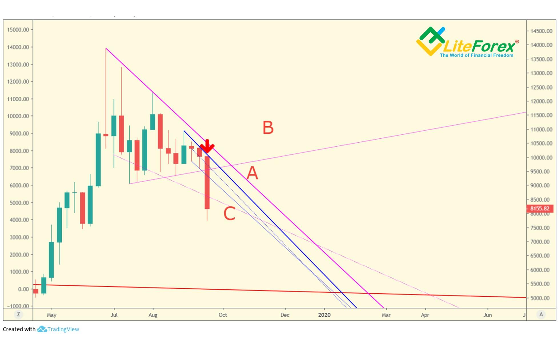
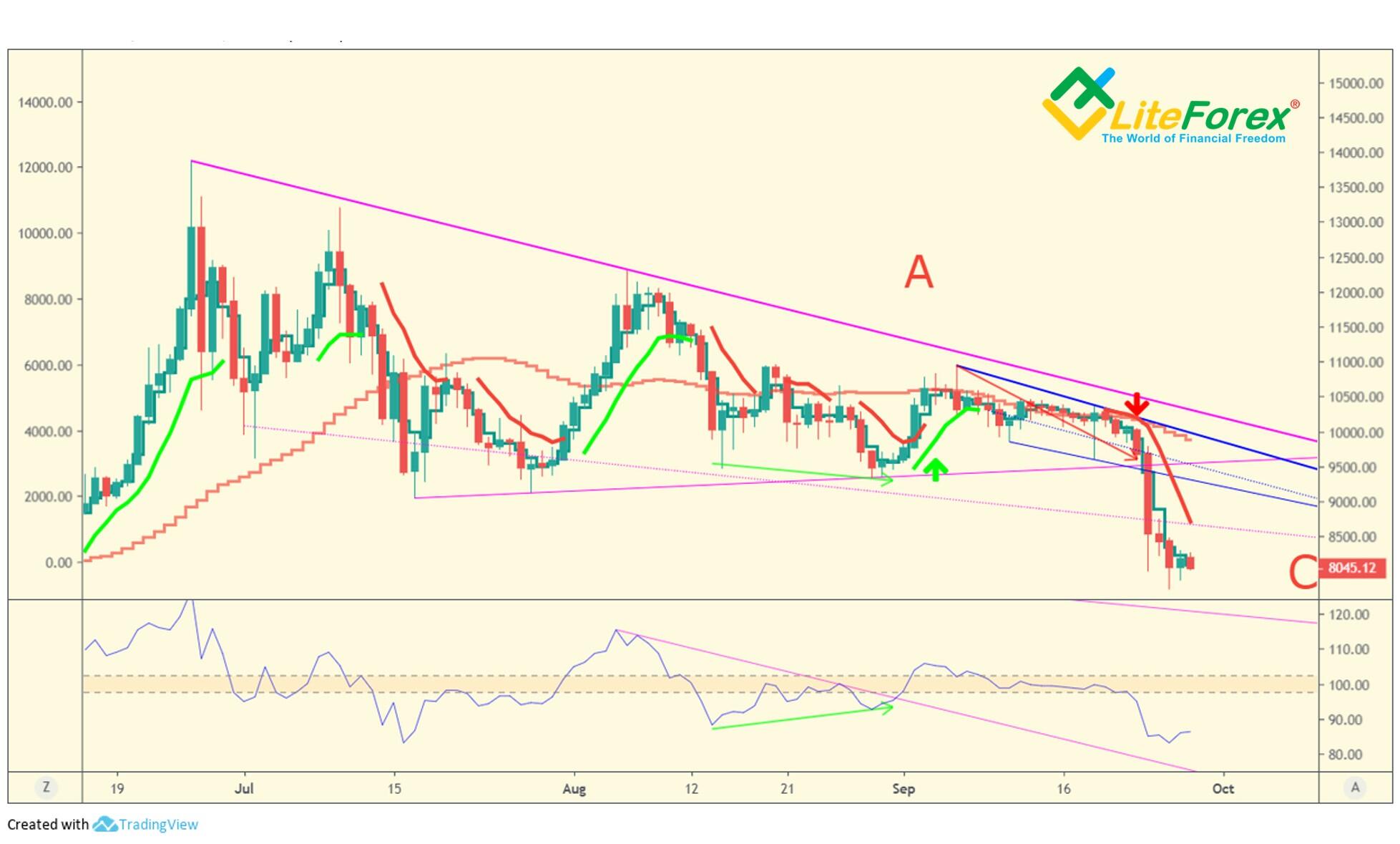
This time, I will analyze the current BTCUSD market situation step by step as an example.
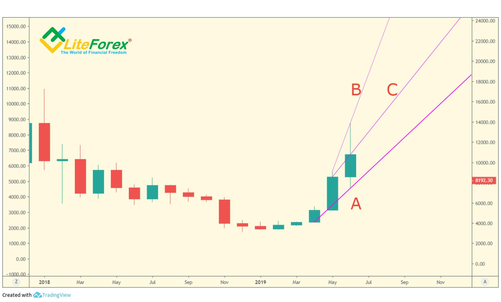
The chart displays three lines:
A is the trend line
B is the trend strength
C is the indicator of flat
As I wrote before, the trend line in a bullish trend is built according to the lows of the last closed bar and of the one two bars earlier.
A signal of a possible bullish trend exhaustion will be when current bar goes lower than the trend line, and when the flat indicator and the trend line are oppositely directed.
As you see form the above chart, the both lines are directed up, which means that the bullish trend is developing.
Next, there is a red bearish bar that reverses the trend.
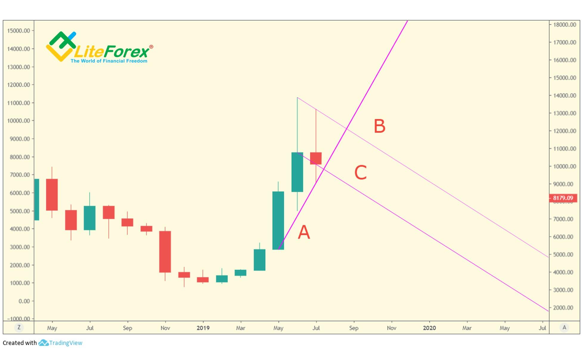
We shift all the lines one bar forward and see that lines (С) and (B) are directed down, which means a potential reversal, and, so, if I have a long position opened, this this and alert and I need to look for an exit point.
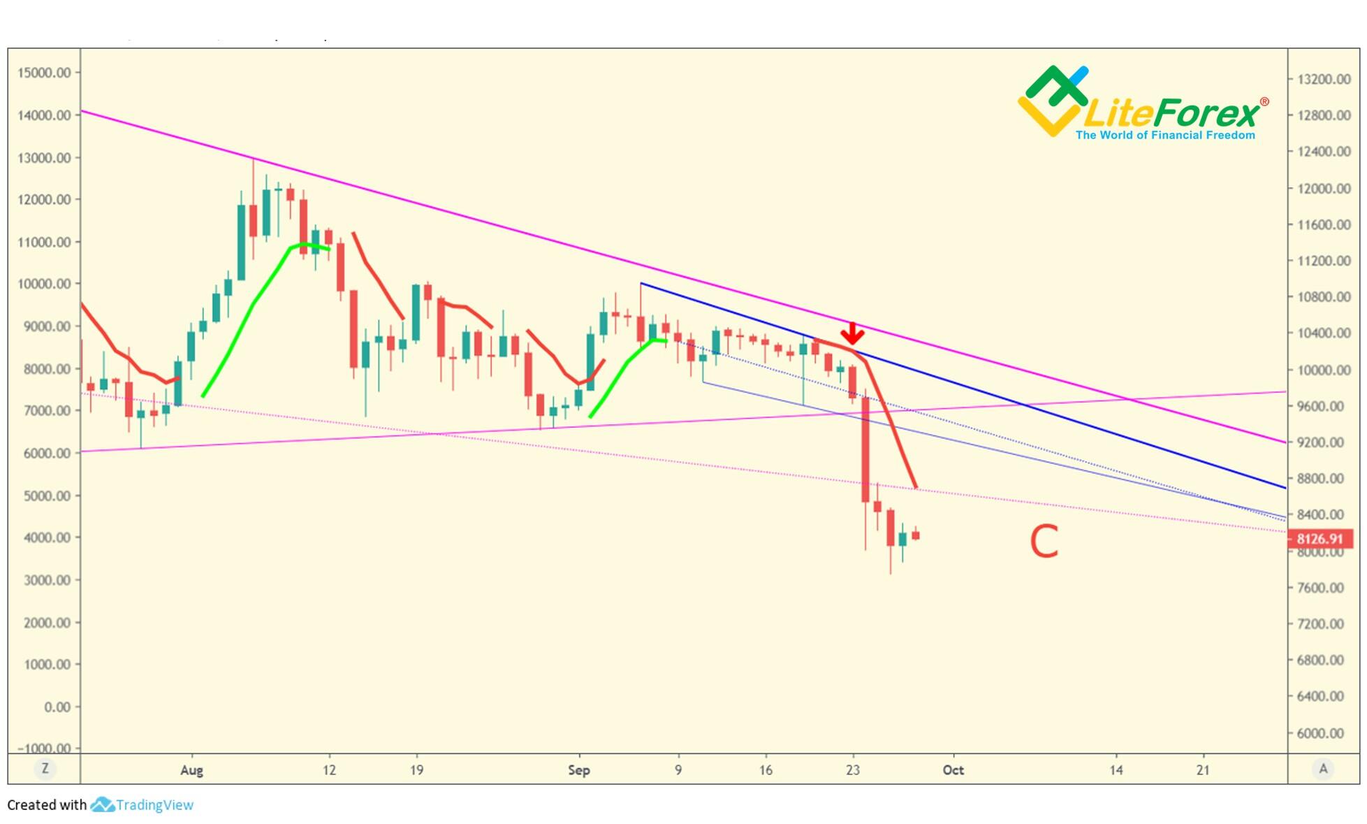
It is clear from the above BTCUSD price chart that the August bar crosses the trend line, this means the trend reversal in the monthly timeframe, and so, when August period finished, the next trend line will be plotted already around highs, as it is suggested for a bearish trend.
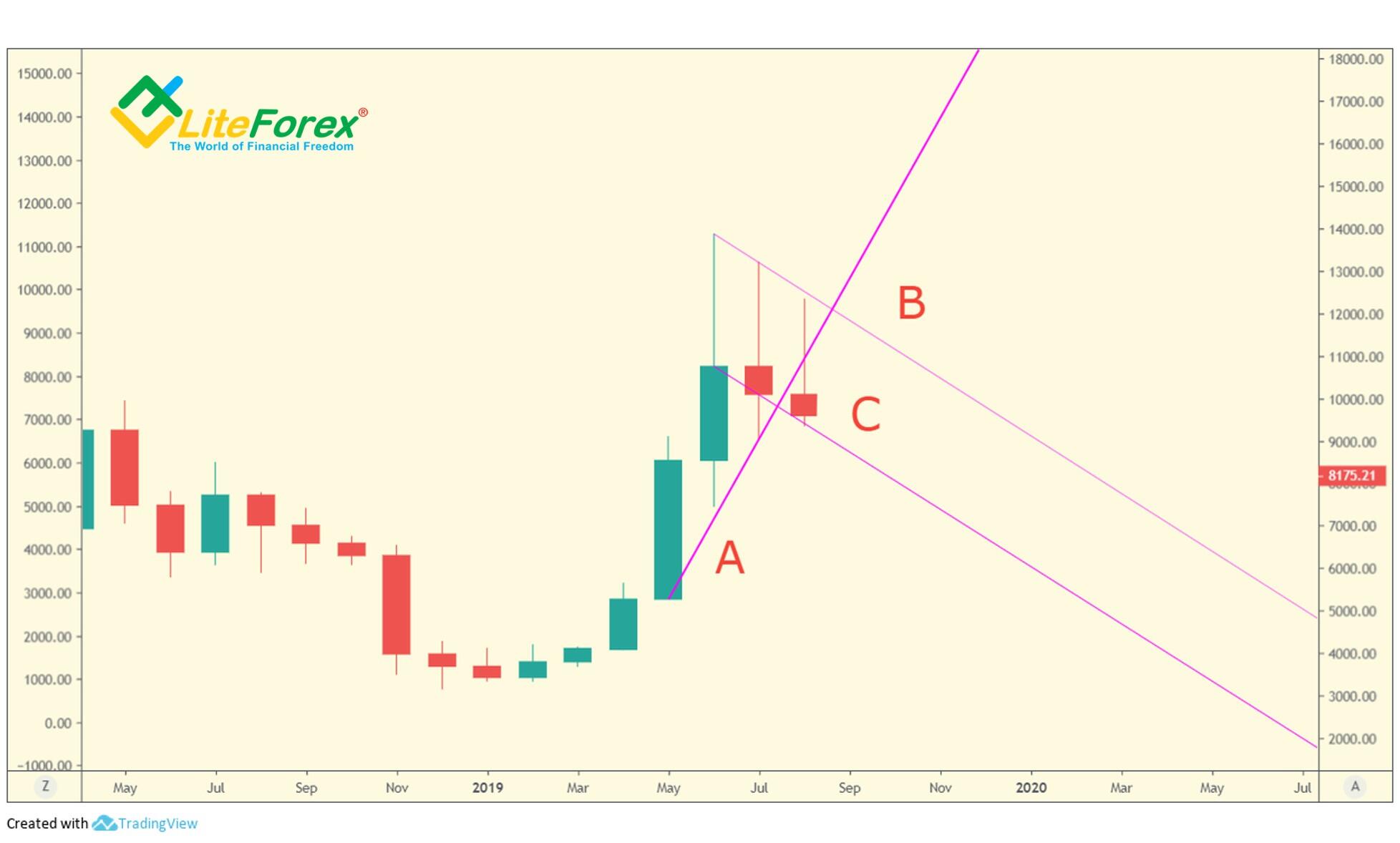
Besides, you see that the shadow of the last candlestick is long enough to take a good profit. Here, the line of the trend strength serves as a resistance for bulls.
By the way, if it was broken through upside, the bearish scenario might be canceled.
But this is not so, and when the August bar closes, the next trend line is built as for the bearish trend (A), and so, we can look for a sell entry.
The trend strength line (B) is still directed up, which is featured by an emerging trend. In addition, this line is the support for bears, as its breakout confirms that the decline will continue.
Flat indicator (C) is directed down, which suggests a soon move down.
Remember, the (A) line is a support for bears in this case, so a short should be entered as close to this sloped line as possible.
Finally, the signal is confirmed, the BTCUSD price goes below the trend strength line B, confirming the bearish trend.
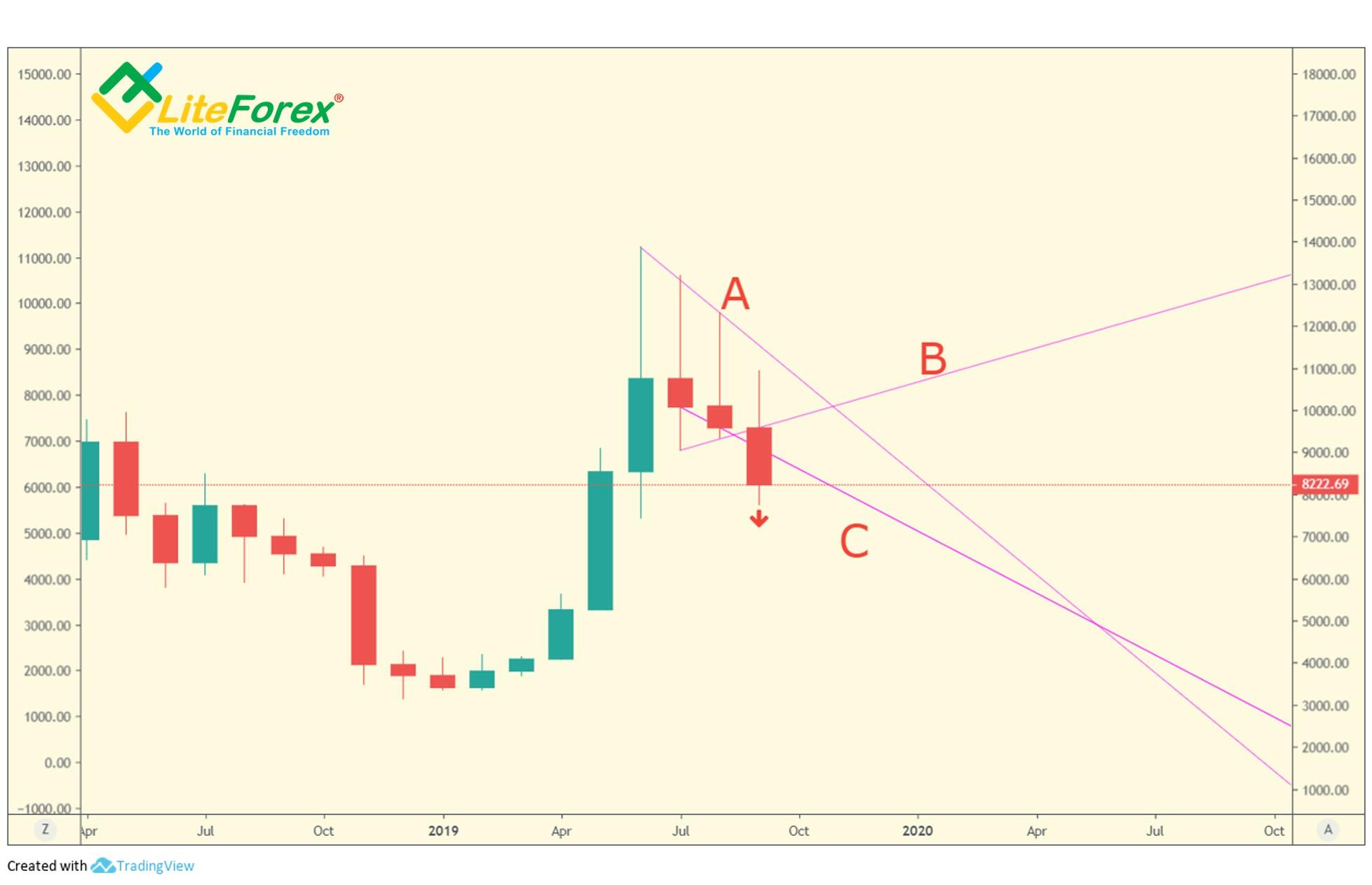
Therefore, we went through the full cycle of the bullish trend reversal down and the beginning of the bearish trend. This indicator works in the same way when a bearish trend changes into a bullish one, however, I must note, that its efficiency is proven only when applied to longer timeframes. Its use in the daily timeframe engages quite a high risk as there may be a lot of false signals resulted from the price noise.v
In case of a divergence, I stick to the principle that the longer-term trend is always stronger and take an advantage of local pullbacks to add up to middle-term positions and to short-term intraday trades, or I try to pick up corrective price moves within a day.
TD Moving Average I (D1 time frame)
Thomas DeMark's TD Moving Average I is a good indicator to analyze shorter time frames. The tool, like other DeMark's indicators, is build based on relative price movements rather than on absolute values, so it doesn’t have many flaws featured by usual Moving Averages.
In short, a bullish MA emerges when the current low is greater than the 12 prior lows; it finishes when the current low, and the three subsequent lows doesn’t exceed the previous 12 lows. Bearish MA is built on a mirror principle.
The color intervals on the TD Moving Average I chart mark the entry points, while the interruption of the line indicates the exhaustion of the ongoing trend. The absence of lines should be interpreted as moments of uncertainty when prices are not trending.
You can learn more about TD Moving Average I in a previous training article. Now, let us move on to practical examples.
Example
As you see from the daily BTCUSD chart above, the monthly and weekly lines indicate a downtrend. Opening of a new week on Monday (marked with a red arrow) is highlighted by the TD Moving Average I from above, which signals a local bearish trend.
Taking into account that the TD Moving Average I changed its color to red at the end of last week, we can safely enter short trades in the bearish trend, without waiting for additional signals.
TD Moving Average II and ROC indicator (monthly, weekly, and daily timeframes)
However, the market situation is not always as clear.
If there is a sideways trend, trades entered according to trend line analysis and the analysis based on TD Moving Average I do not yield sufficient profits and sometimes even lead to losses. So, these technical analysis tools should be employed in conjunction with other indicators, including, for example, TD Moving Average II and ROC.
In classical form, TD Moving Average II are two moving averages that are built according to closing prices. The first of them is a three-bar, the second MA is slow, thirty-four bar. The fast MA is built upon the comparison with the close two bars ago, and the slow one – upon the comparison with the previous bar’s close. You can learn more about TD Moving Average II in a previous training post.
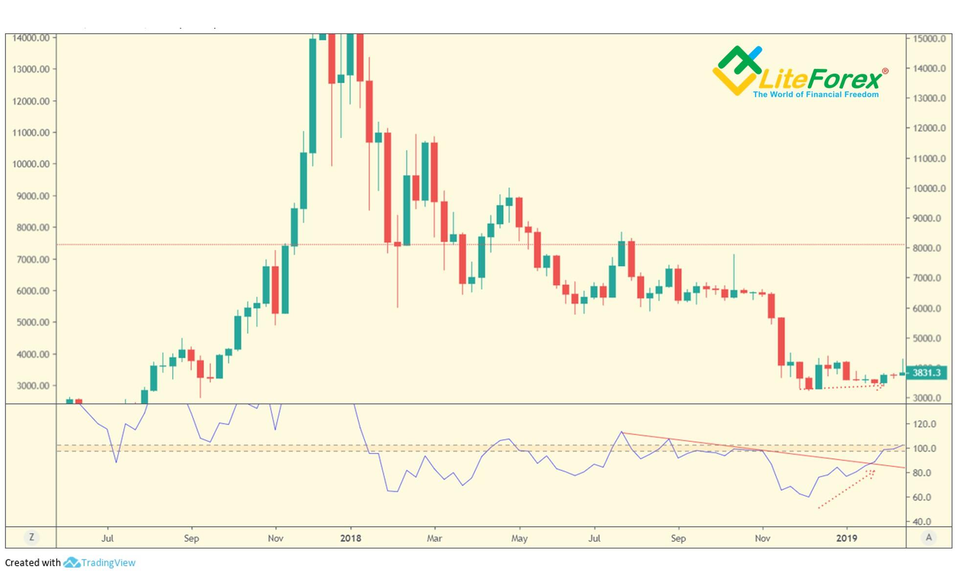
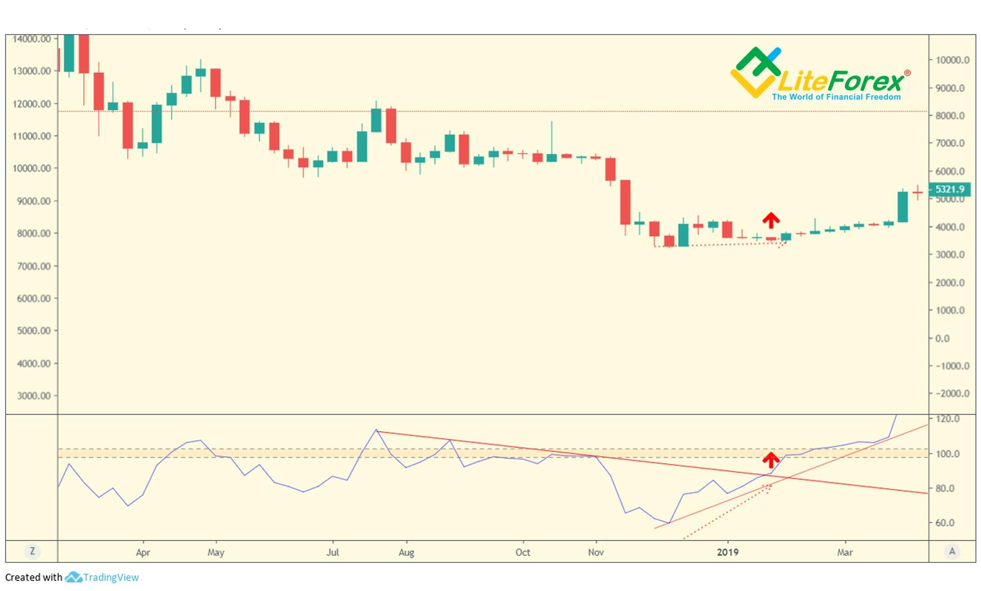
TD Rate of change (TD ROC) indicates the overbought/oversold zones that compares the current close with the closing prices of the previous 12 bars. It is very easy to use. The zone of balance is in a narrow band between levels 97.5 and 102.5. Correspondingly, bear zone is below this range, and bull zone is above. Another benefit is that you can draw common patterns right in the indicator window.
They help you identify divergence (opposite trends indicated by the oscillator and the price chart) that is thought to be quite a strong signal of the trend exhaustion, as well as the breakouts of the support/resistance levels, followed by the trend reversal. You can learn more about the TD ROC from the article devoted to DeMark oscillators.
Application of TD Moving Average II and TD ROC in conjunction
One should go short when the fast MA of the TD Moving Average II is below the slow MA, and the ROC indicator line goes outside the balance zone down. In addition, you shouldn’t enter a trade when the ROC in in the neutral zone. In case with a buy trade, the conditions are the opposite. You enter a long, when the fast MA is above the slow one, and the ROC breaks out the neutral zone upside.
Examples
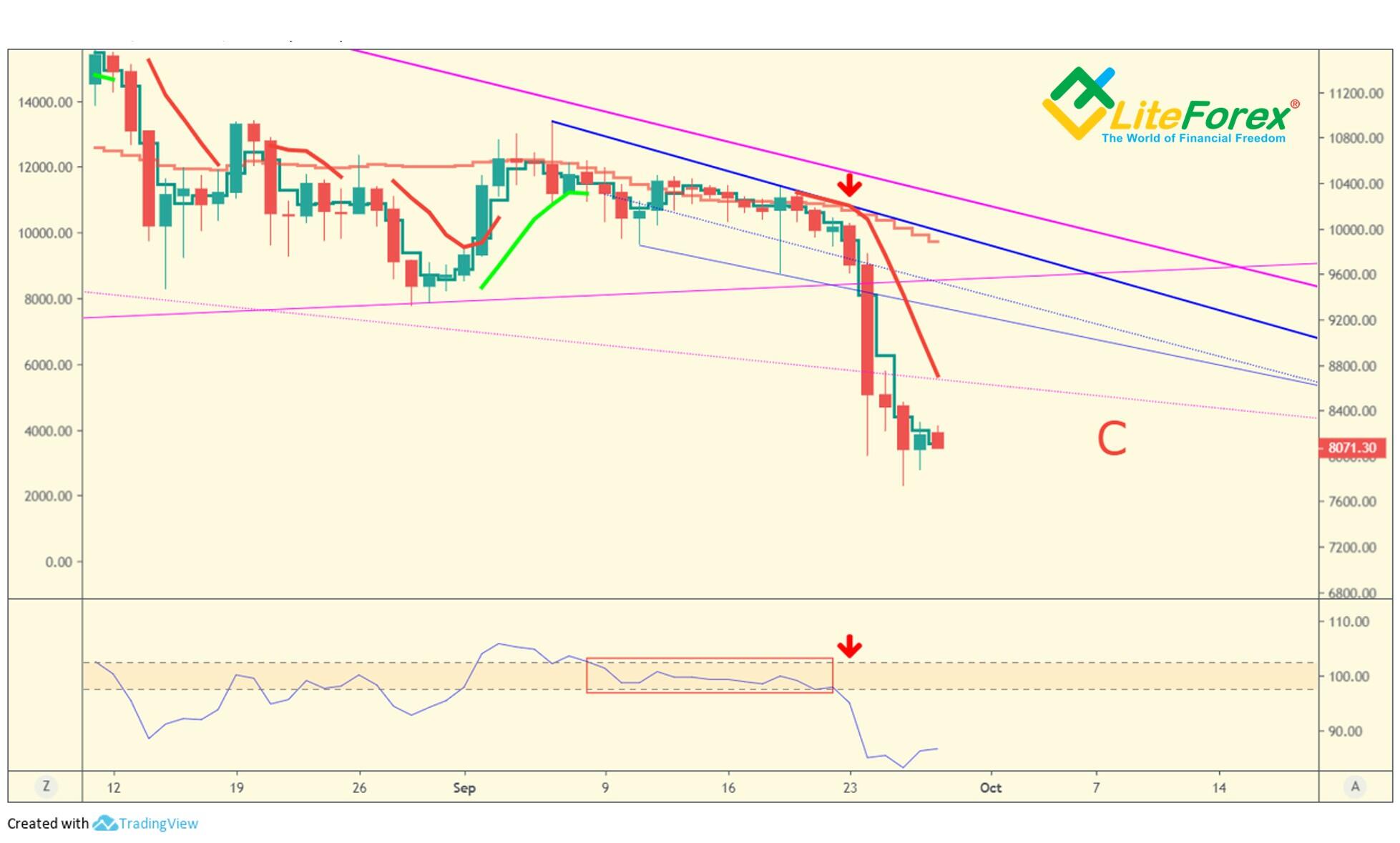
It is clear from the above chart that the sell signal is confirmed as the ROC goes down out of the balance zone and the fast TD Moving Average II is lower than the slow one.
Besides, I must note that the ROC and the TD Moving Average II and I don’t work well in the monthly timeframes.
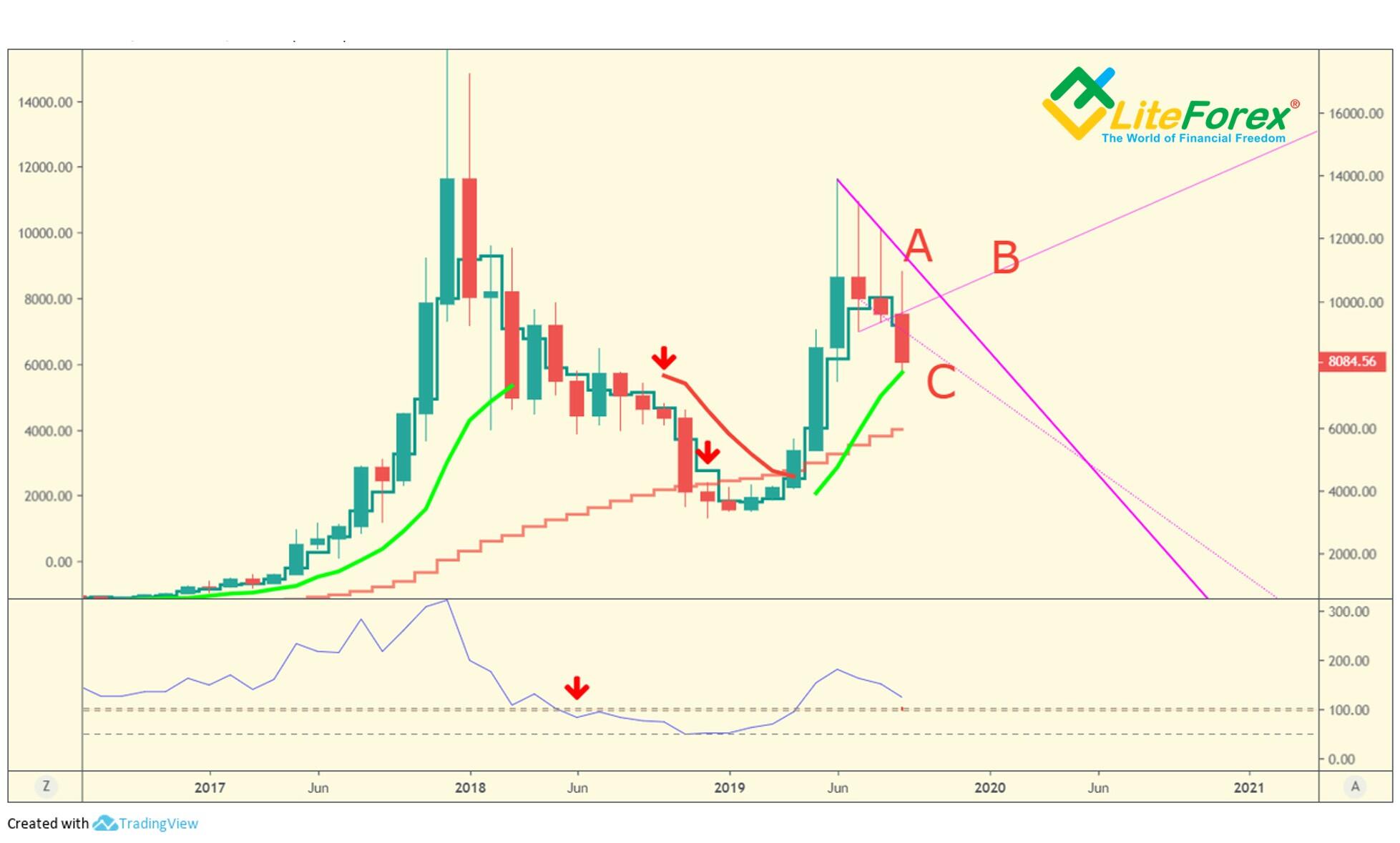
In addition to the conjunction of the TD Moving Average II and TD ROC, I employ trend analysis in the TD ROC indicator itself as a confirming signal (it must not be a primary signal!) in my trend trading strategy. I also use the TD ROC divergence and convergence with the main price chart as a confirming signal.
The above chart presents an example how ROC trend analysis works. Like in case with the price chart, indicator builds a trend line according to the highs for a bearish trend, and according to the lows – for the bullish trend.
As you see, the indicator sharply deviates from the trend line following a sharp price drop, this is the signal that the market is overheated. This overheat declines when the market goes back close to the trend line. In addition, when the indicator changes its direction, opposite to the price movement, there is a divergence, the first and the earliest signal of the trend reversal.
Next, you see that the ROC indicator breaks out the trend line, this is the second, confirming signal. As history proves, there was actually a reversal and the bullish trend started.
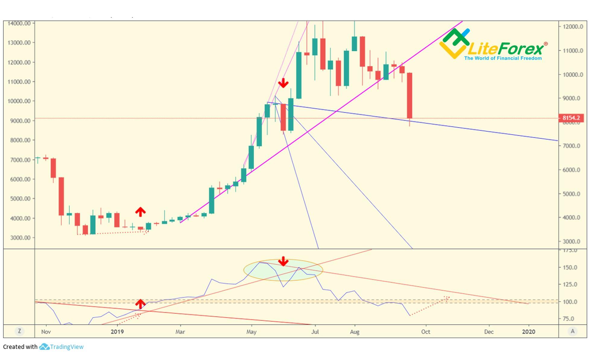
Next, we shall analyze an interesting case, when the bullish trend is developing up, but there is a sudden drawdown.
You see that the growth resumes next; but imagine that you are in a situation when you don’t know where the price will go.
First of all, note that the down move, despite its length, doesn’t breaks through the trend line. Therefore, it is too early to expect the trend reversal.
The second sign is that the ROC breaks the trend line downside, but there hasn't been divergence or convergence, which is necessary conditions for a trend reversal.
Therefore, the bearish trend indicated on the weekly timeframe is not confirmed, and we avoid losses that could result from a false sell signal.
I want to stress that I apply the ROC trend lines in conjunction with the divergence/convergence signal only to the weekly timeframe. It is used in the shorter timeframes in the same way, but there may be a lot of false signals.
It is clear from the above chart, that the trend line breakout, according to ROC, along with the convergence doesn’t result in the trend reversal, it only marks a corrective movement. Differently put, signals of this indicator in shorter timeframes may be interpreted as the trend reversal signals only provided that they are confirmed by the corresponding signals in a longer timeframe. Otherwise, this signal indicates a correction and may be used to add up to a position entered in the trend direction.
Now, I’d like to sum up main rules of the strategy:
- Never enter a trade opposite to the global trend.
- Always analyze three timeframes at the same time, monthly, weekly and daily,
- Signals delivered in long-term timeframe are always stronger than the signals sent in the short-term chart.
- The signal to validate the trend reversal must be confirmed by the corresponding signal in all the timeframes analyzed.
- The reversal signal is validated when:
For monthly or weekly timeframe:
- The trend line (A) is broken through in the price chart.
- The ROC trend line is broken through, and there is convergence or divergence.
For the weekly timeframe and shorter ones:
- Conjunction of the TD Moving Average II + ROC (it should go outside the balance zone).
For the daily timeframe and shorter ones:
- Conjunction of the TD Moving Average II + ROC (it should go outside the balance zone).
How to trade with this strategy?
There are several ways, and I suggest analyzing each of them.
The easiest way to apply the strategy is to trade with the trend.
In this case, you should ideally enter a trade when there is a flat or a trend in the monthly timeframe, and there is a clear trend in the weekly and daily timeframes (in the direction of the trend in the monthly timeframe if the market is trending there) and there is a confirmation.
In this case, you enter a trade in the trend direction and put a stop loss at the trendline (A). Therefore, all you need is to update the trendlines in the monthly and weekly timeframes when new bars open once a week and move stop loss according the signal of the indicators.
If the trend reversal is confirmed at the daily and weekly timeframes, and the monthly timeframes indicates the trend exhaustion, you take the profit, exit this trade and enter an opposite trade.
This trading style will suite busy people who do not want to just hold an asset, but they do not have enough time to monitor the market every day.
This strategy suggests that you shouldn’t analyze timeframes that are shorter than H1, as you can confused by the market noise which makes it harder to take a wise trading decision.
Those, who prefer more frequent trades, can analyze H4 timeframe.
In this case, you should take into account the signal delivered in the monthly timeframe, but you enter a trade based on the signals discovered in the weekly/monthly/4-hour timeframes.
With this approach, you may enter a few trades a week.
I will describe another cryptocurrency trading strategy on the basis of Thomas DeMark's indicators in my next article.
Subscribe to the blog to stay informed!
I wish you good luck and good profits!
PS. If you agree with my ideas, write “+” in the comments; if you don’t agree, put “-”. If you liked the post, just write thank you, and don’t forget to share the post. It is easy for you and I will be very pleased :)
Stay informed on the latest cryptocurrency news, follow my posts on the blog.
Useful links:
I recommend trying to trade with a reliable broker here. The system allows you to trade by yourself or copy successful traders from all across the globe.
Telegram channel with high-quality analytics, Forex reviews, training articles, and other useful things for traders http://t.me/litefinance.

Price chart of BTCUSD in real time mode
The content of this article reflects the author’s opinion and does not necessarily reflect the official position of LiteFinance broker. The material published on this page is provided for informational purposes only and should not be considered as the provision of investment advice for the purposes of Directive 2014/65/EU.
According to copyright law, this article is considered intellectual property, which includes a prohibition on copying and distributing it without consent.